Case Study · 02
Spheriq
Leading product design for a Swiss funding platform
Spheriq is a Swiss funding platform that helps organizations, foundations, experts, and companies find each other, manage funding requests, build research lists, and collaborate across the nonprofit sector.
I joined the project as Lead Product Designer after the platform was already live. Over three years, I helped redesign the portal module by module — improving legacy interfaces, creating a more consistent design system, designing core funding workflows, and supporting the evolution from StiftungSchweiz into Spheriq.
01 — Context
A live platform with years of accumulated complexity
When I joined the project, Spheriq was already a live platform with real users, existing data, and years of accumulated product logic. The challenge was not to redesign everything from scratch, but to improve a large system step by step while keeping the platform usable.
The old experience had many of the typical problems of a growing legacy product: inconsistent components, outdated UI patterns, complex navigation, weak mobile support, and product areas that felt disconnected from each other.
02 — My Role
Main product designer across the portal
As Lead Product Designer, I worked across the portal's core product experience — from funding and research workflows to collaboration spaces, organization profiles, AI tools, mobile patterns, and the public website.
My work covered product analysis, UX structure, interface design, component design, mobile adaptations, and developer handoff. I worked from client requirements and business goals, then translated them into product flows, interface logic, and developer-ready designs.
- Funding workflows
- Research tools
- Networks
- Organization portraits
- Design system
- Mobile web
- Public website
03 — The Challenge
Redesigning without starting over
I was not designing a new product from scratch. Spheriq was already live, with existing users, existing data, and many product decisions that had been made before I joined.
The redesign had to happen gradually. We worked module by module, while older parts of the platform continued to exist next to newer ones. Each new solution had to fit the existing system, respect current technical constraints, and stay clear for users who were already familiar with the platform.
04 — Product Ecosystem
Designing across a connected ecosystem
Spheriq had many product areas that were closely connected. A user could move from search into a research list, open an organization portrait, start a grant request, and later continue the work inside a network or contact history.
This meant that I could not design each module as a separate page. Every solution had to make sense inside the wider portal and stay consistent with how users moved through the product.
- Search
- Research & Lists
- Grant Requests
- Donations
- Networks
- Organization Portraits
- Contact History
- Public Website
- Dashboard
- Notifications
- Account & Settings
- Stiftung AI
- Supporting Workflows
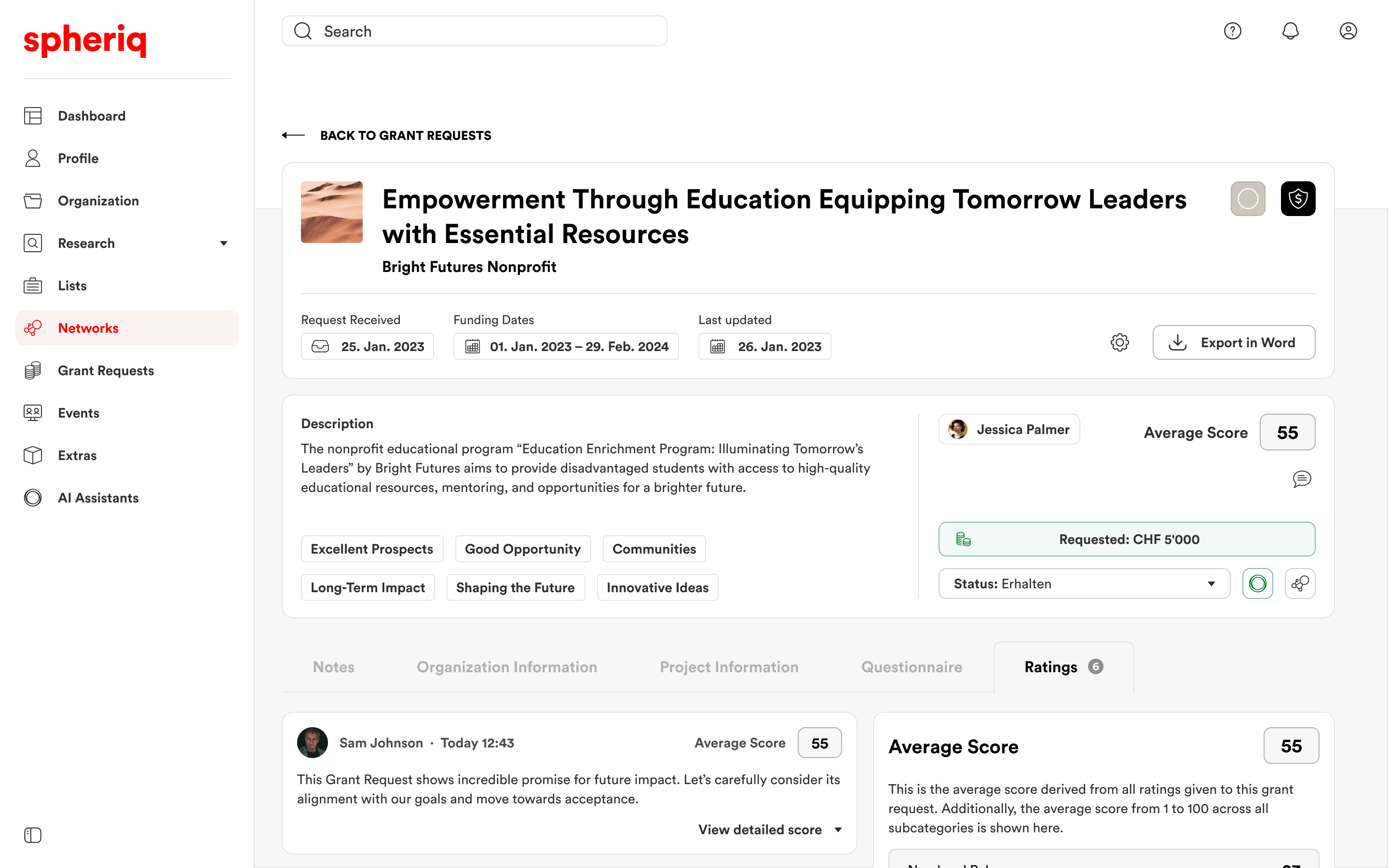
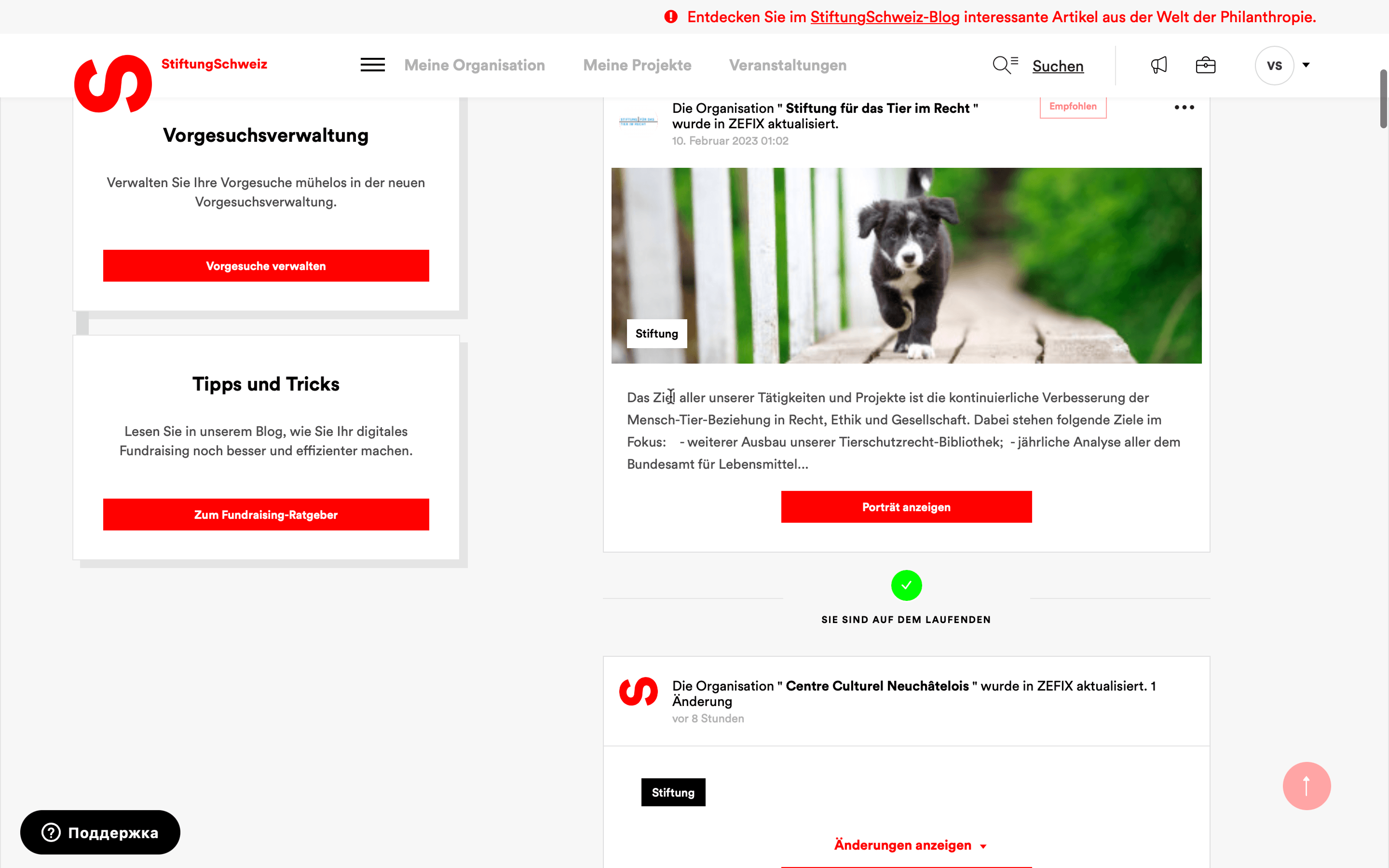
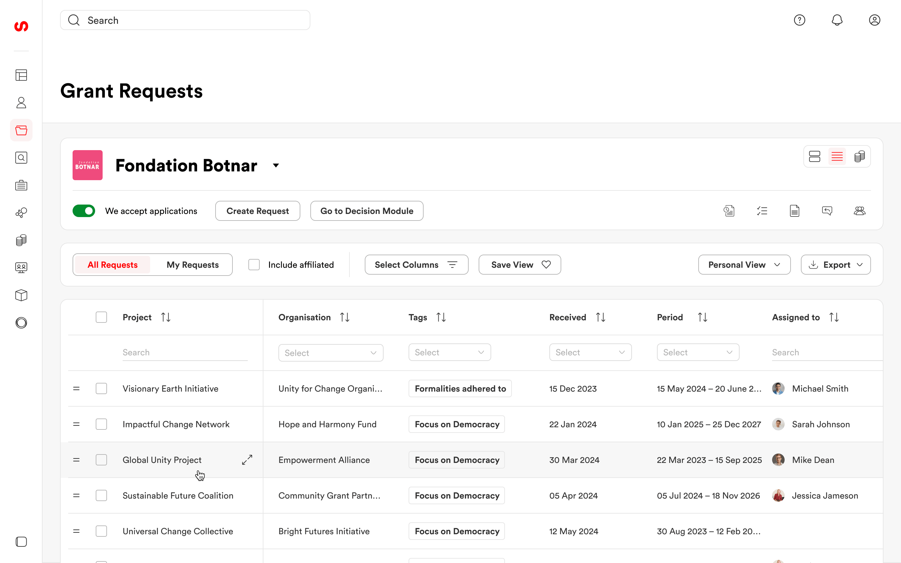
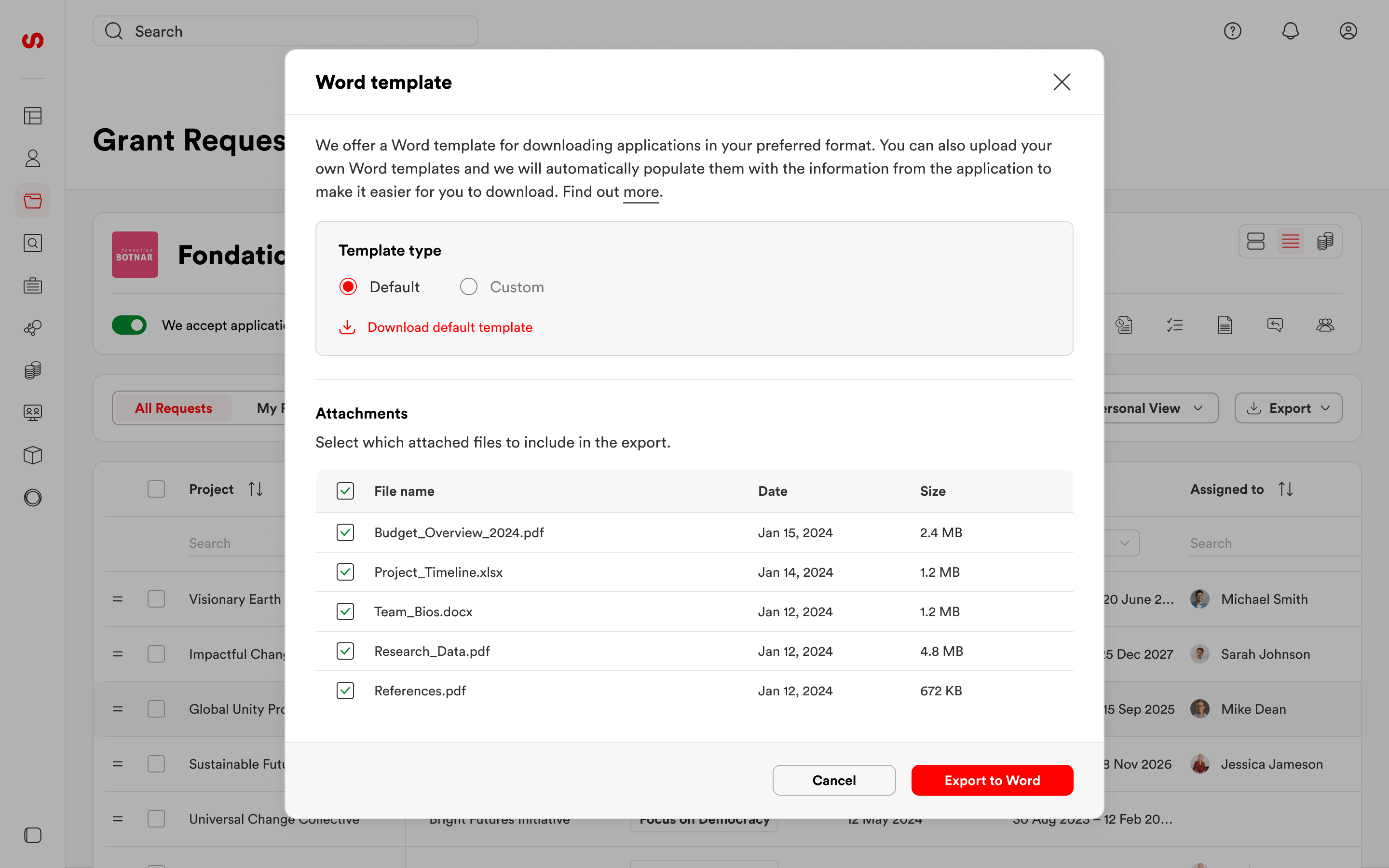
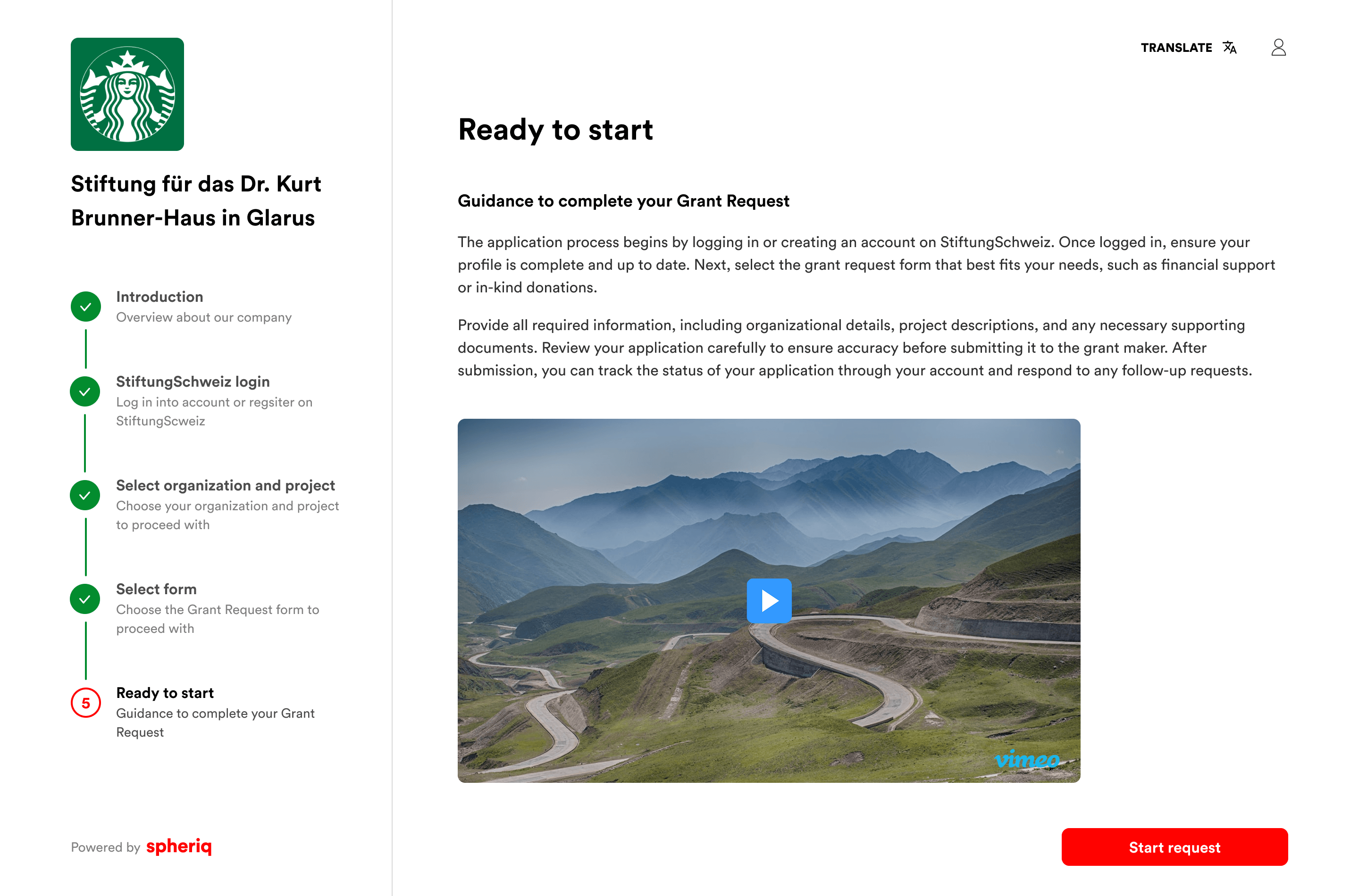
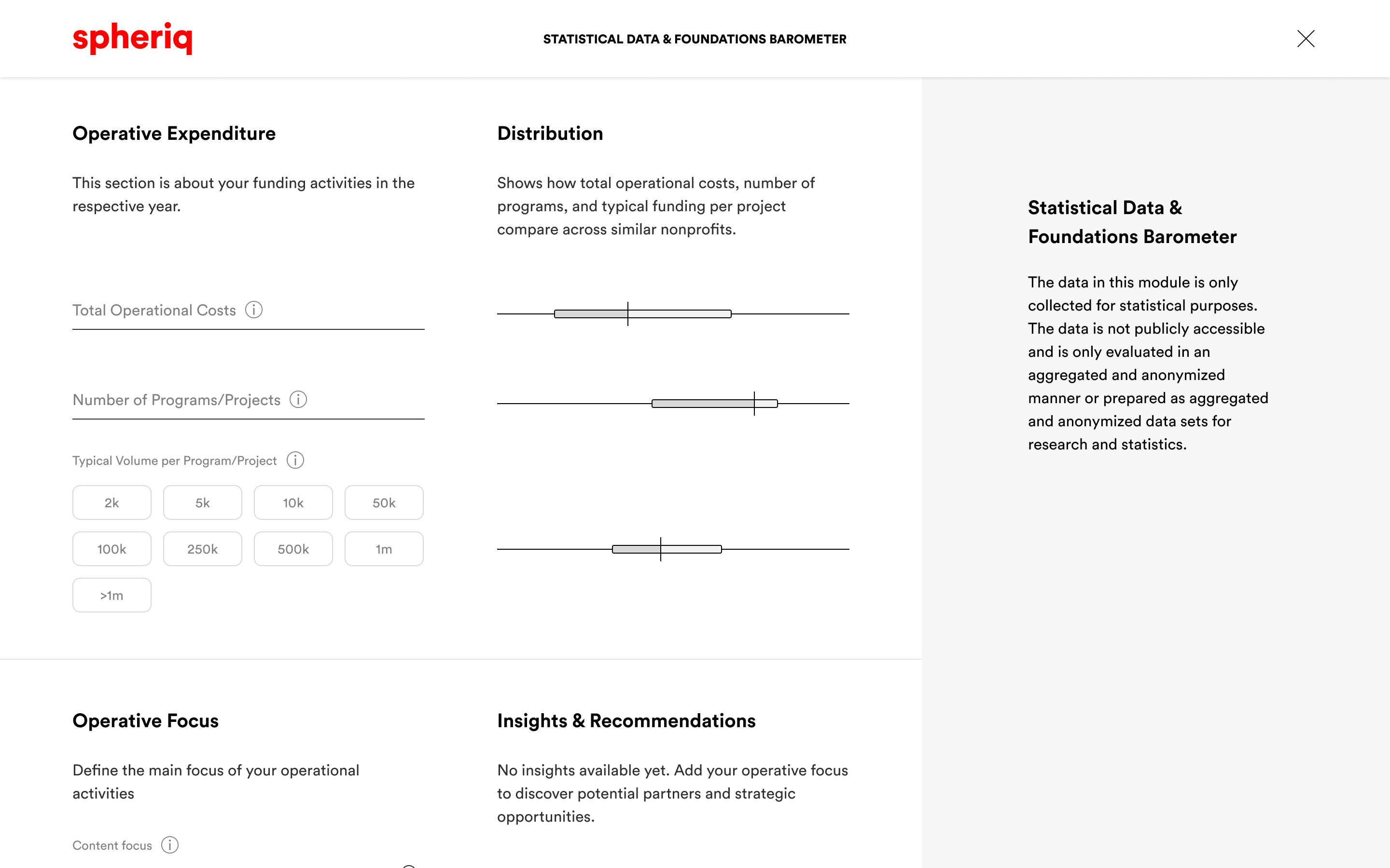
05 — Grant Requests
Helping foundations review funding applications
Grant Requests became one of the core workflows of the platform. I designed the experience for both sides: organizations applying for funding and foundations reviewing incoming applications.
For foundations, the main challenge was to bring the full review process into one place. They needed to see the application, understand the organization and project behind it, add internal notes and ratings, change the status, export documents, and keep track of previous interactions with the applicant.
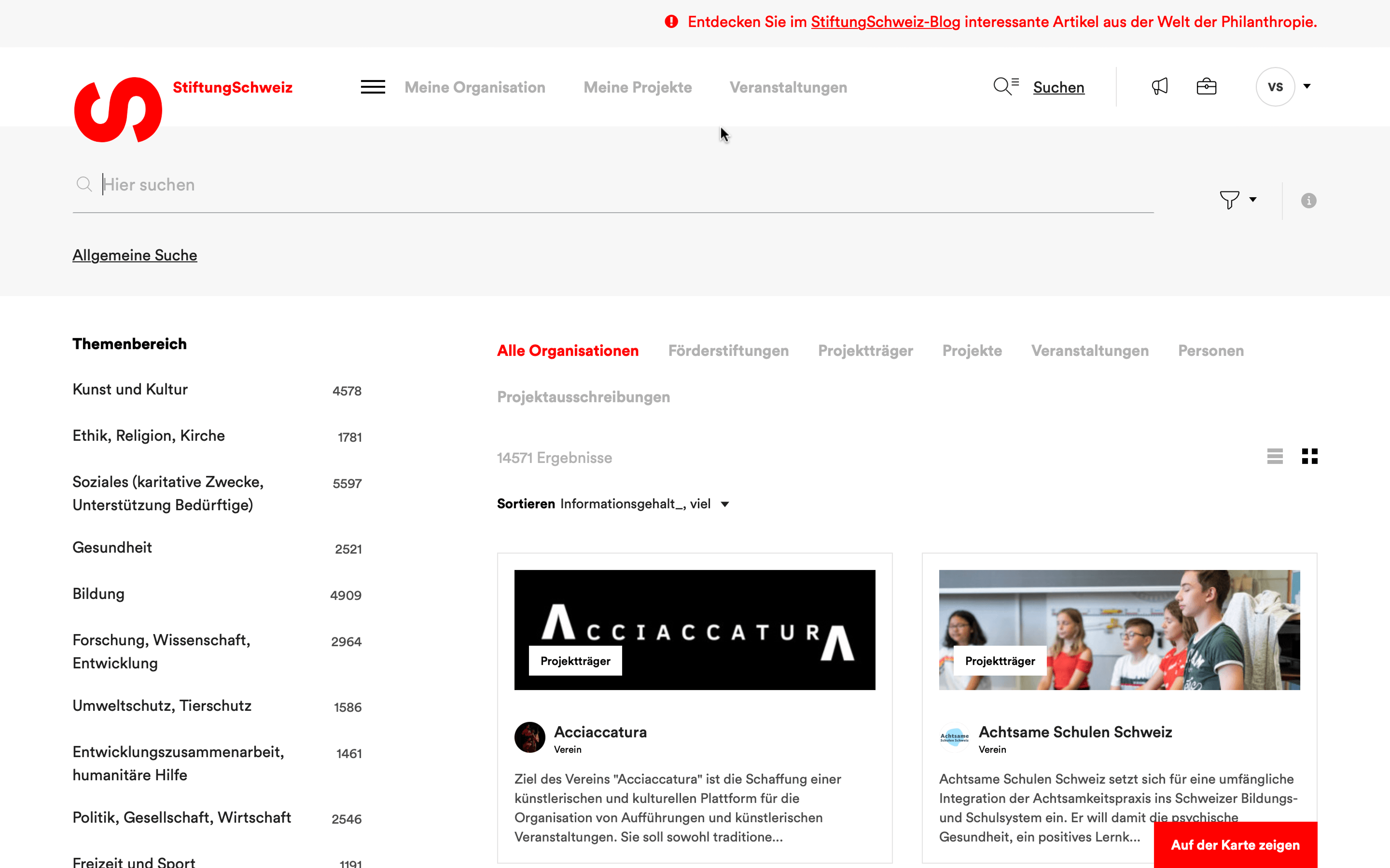
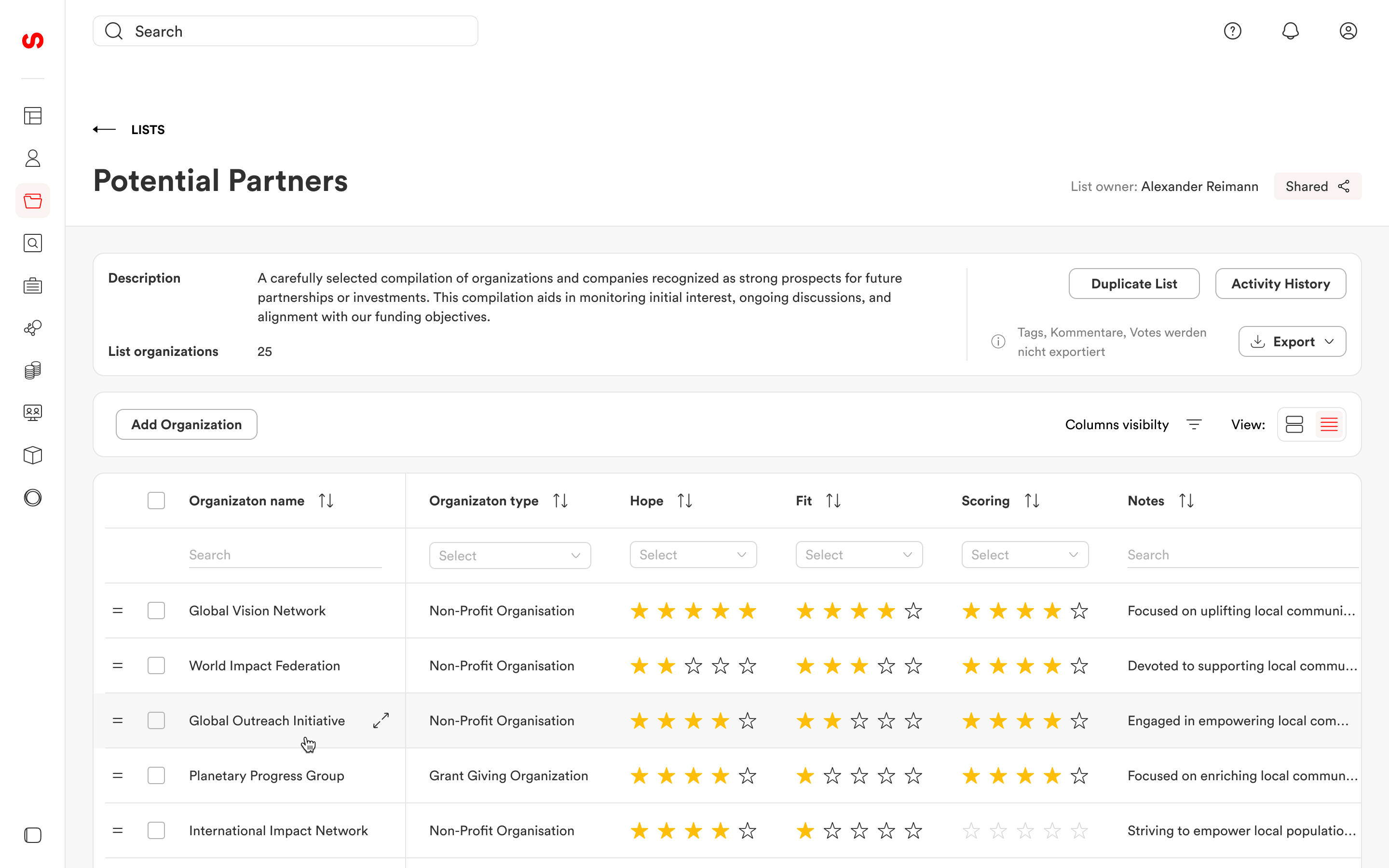
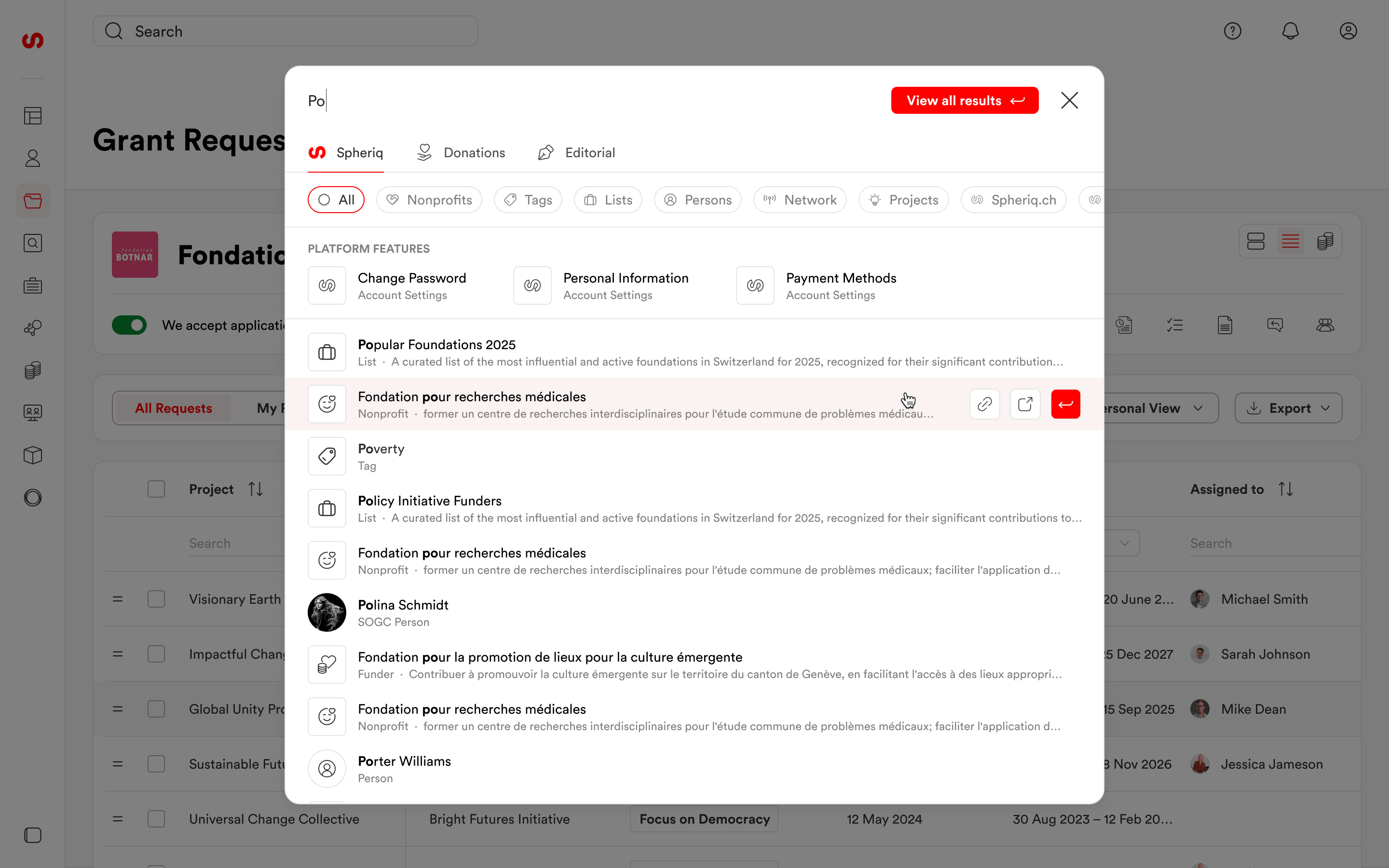
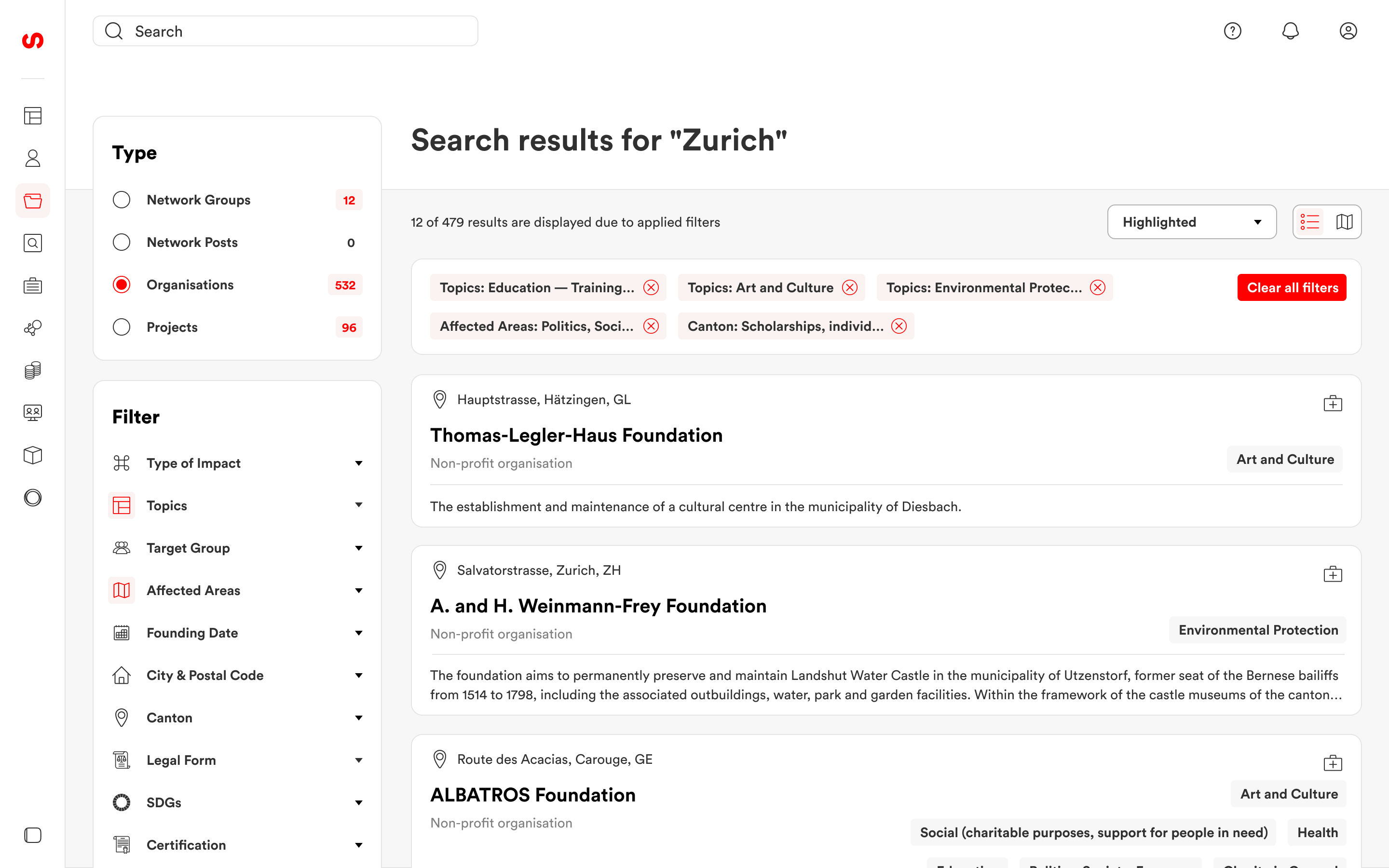
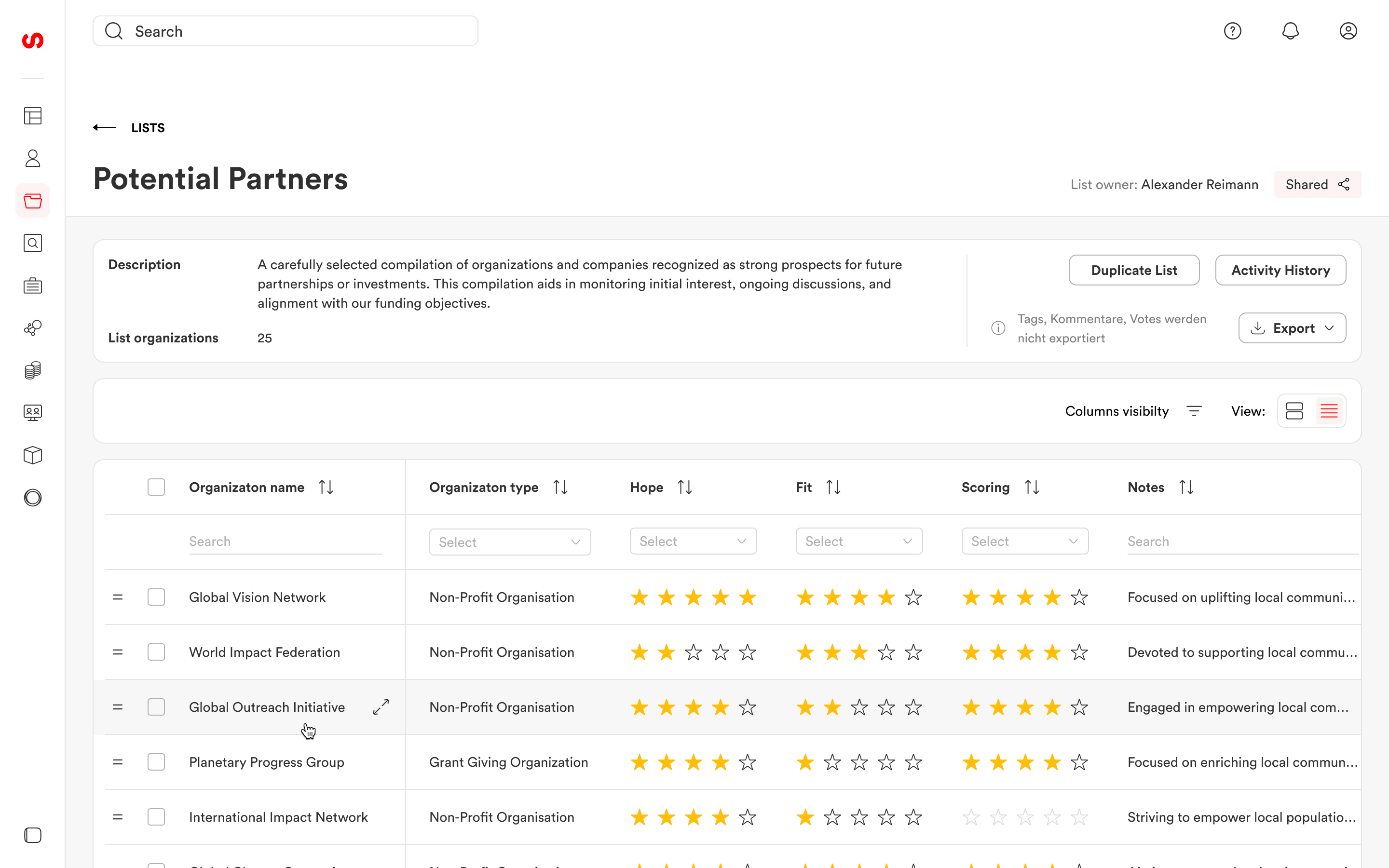
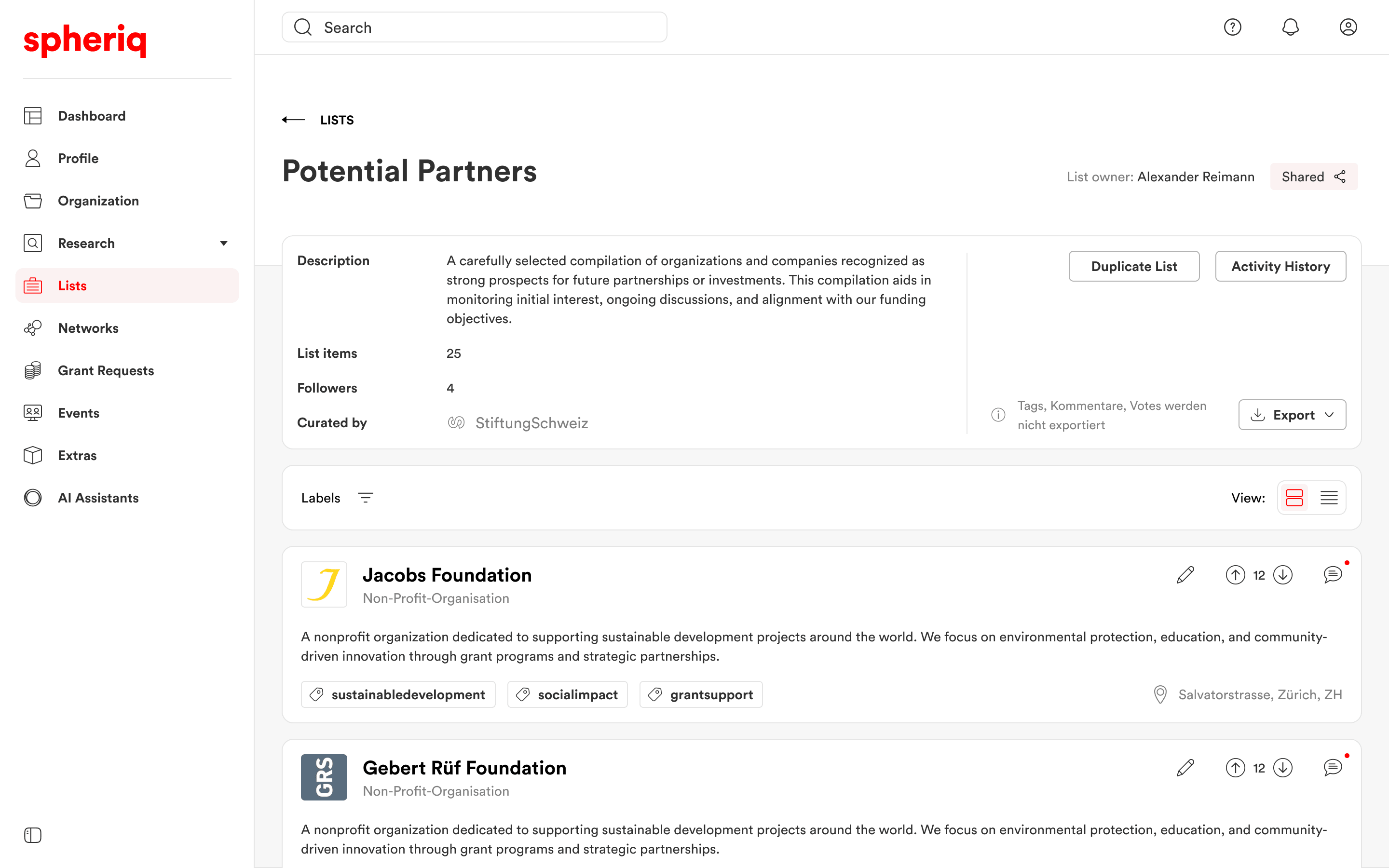
06 — Lists & Search
Turning search into a research workflow
Search and Lists worked together as the research layer of the platform. Users could find organizations or projects, save relevant results, compare potential partners, add notes and labels, and share lists with their team.
Users did not always finish their work in one session. They might start with a simple search, then return later to a saved list, update ratings, add context, or export the data for internal discussion.
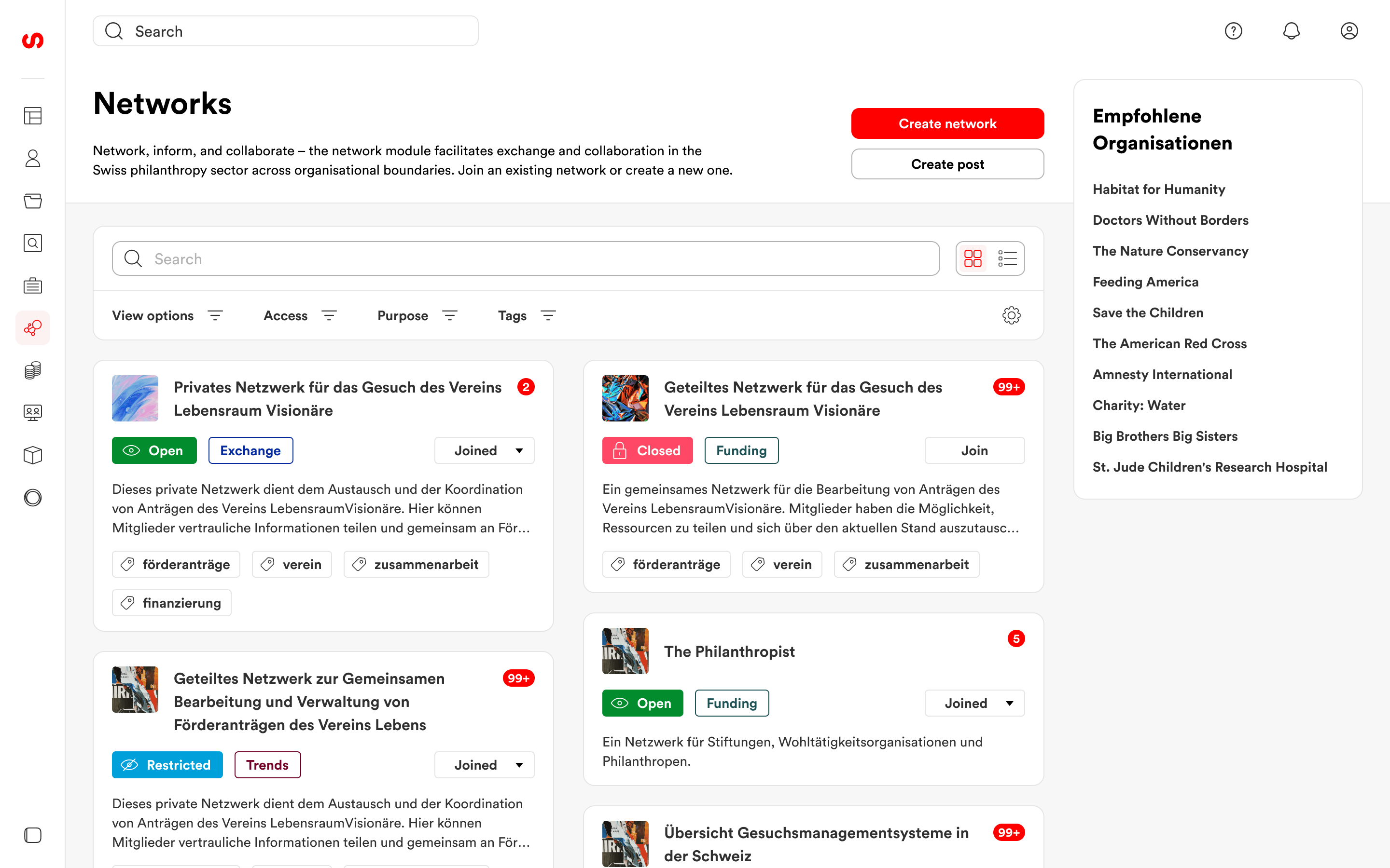
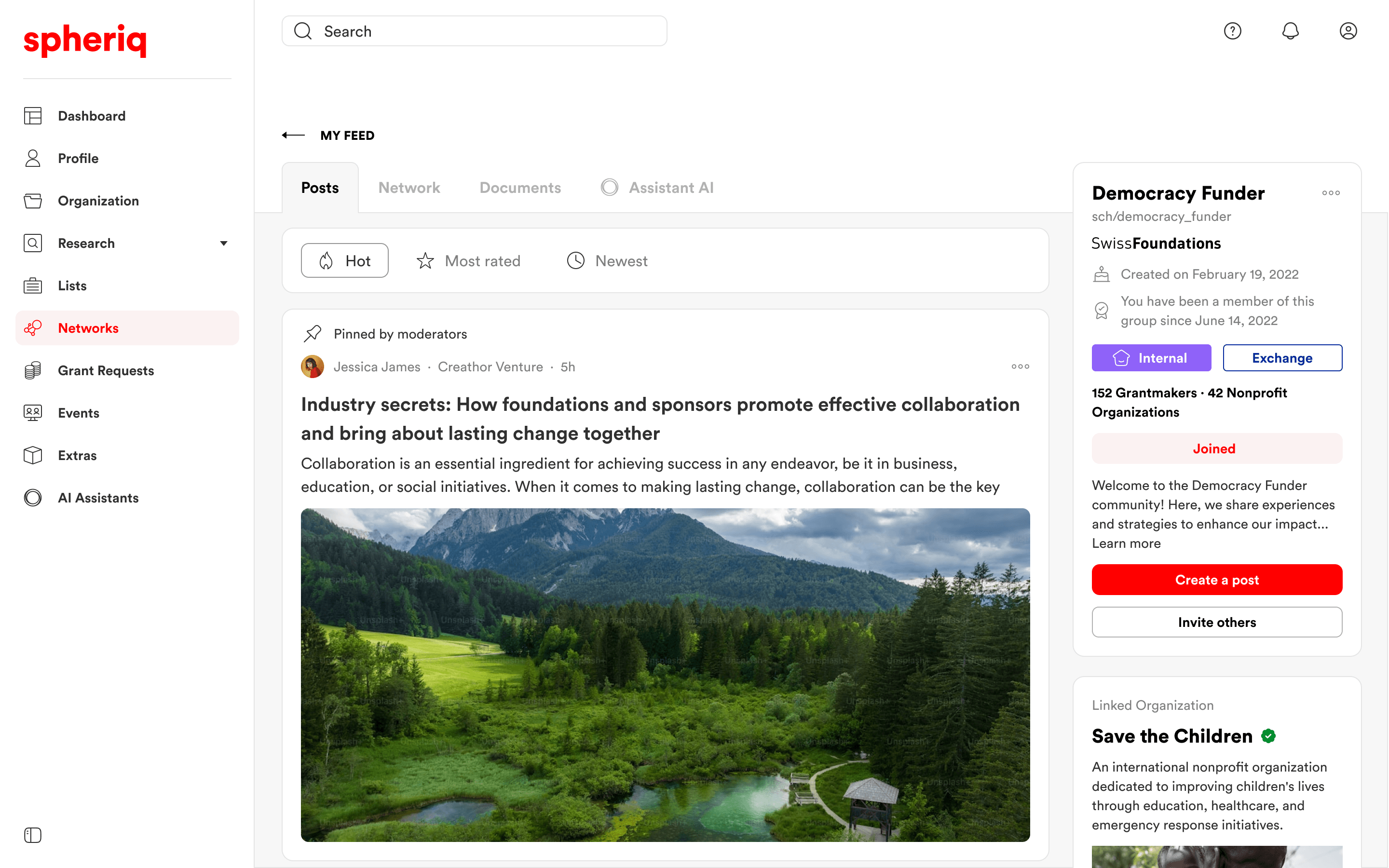
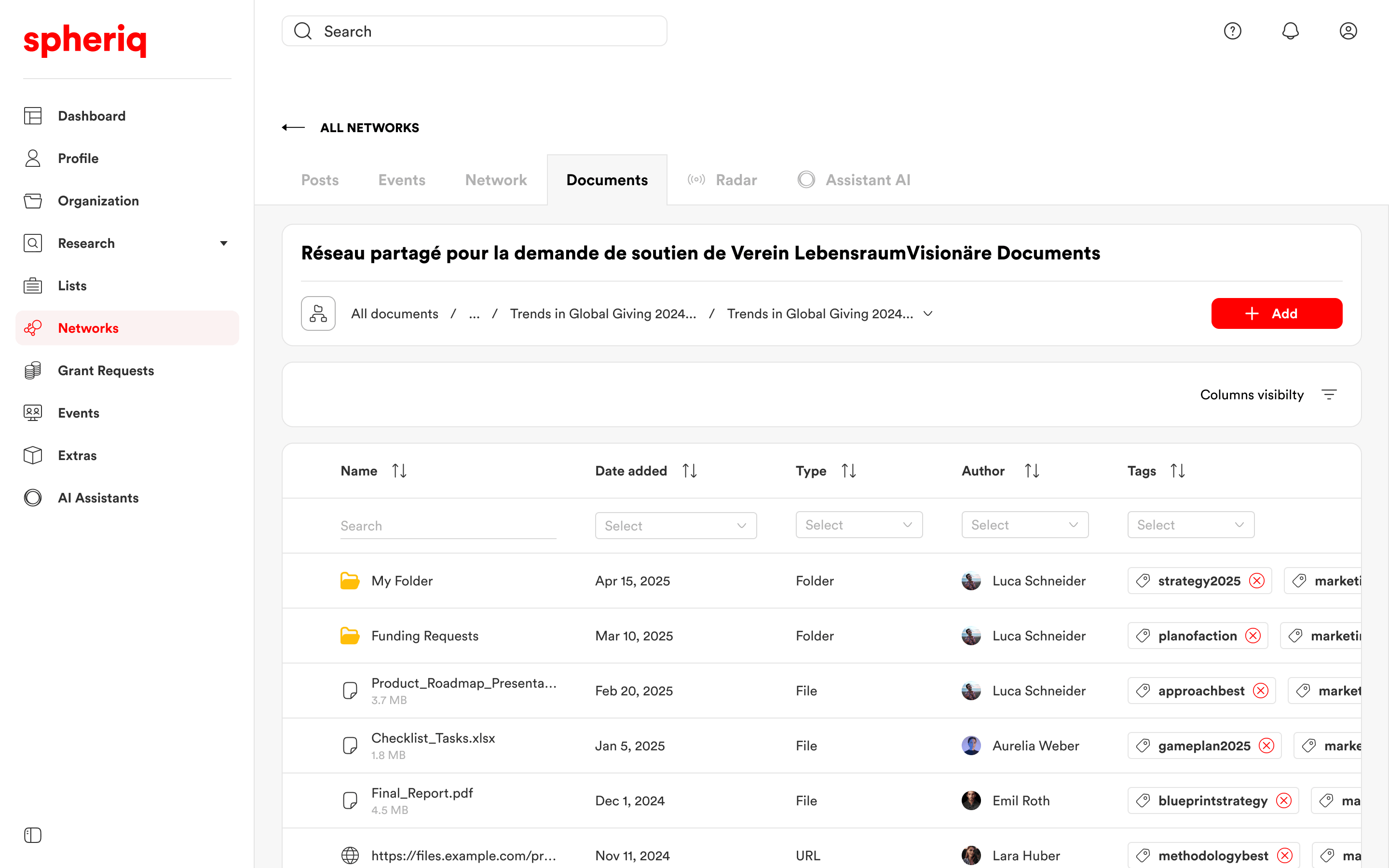
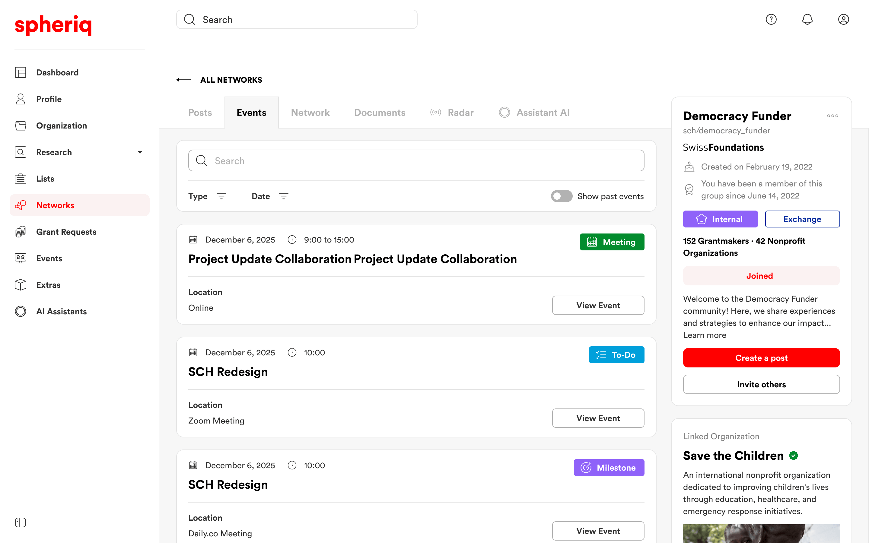
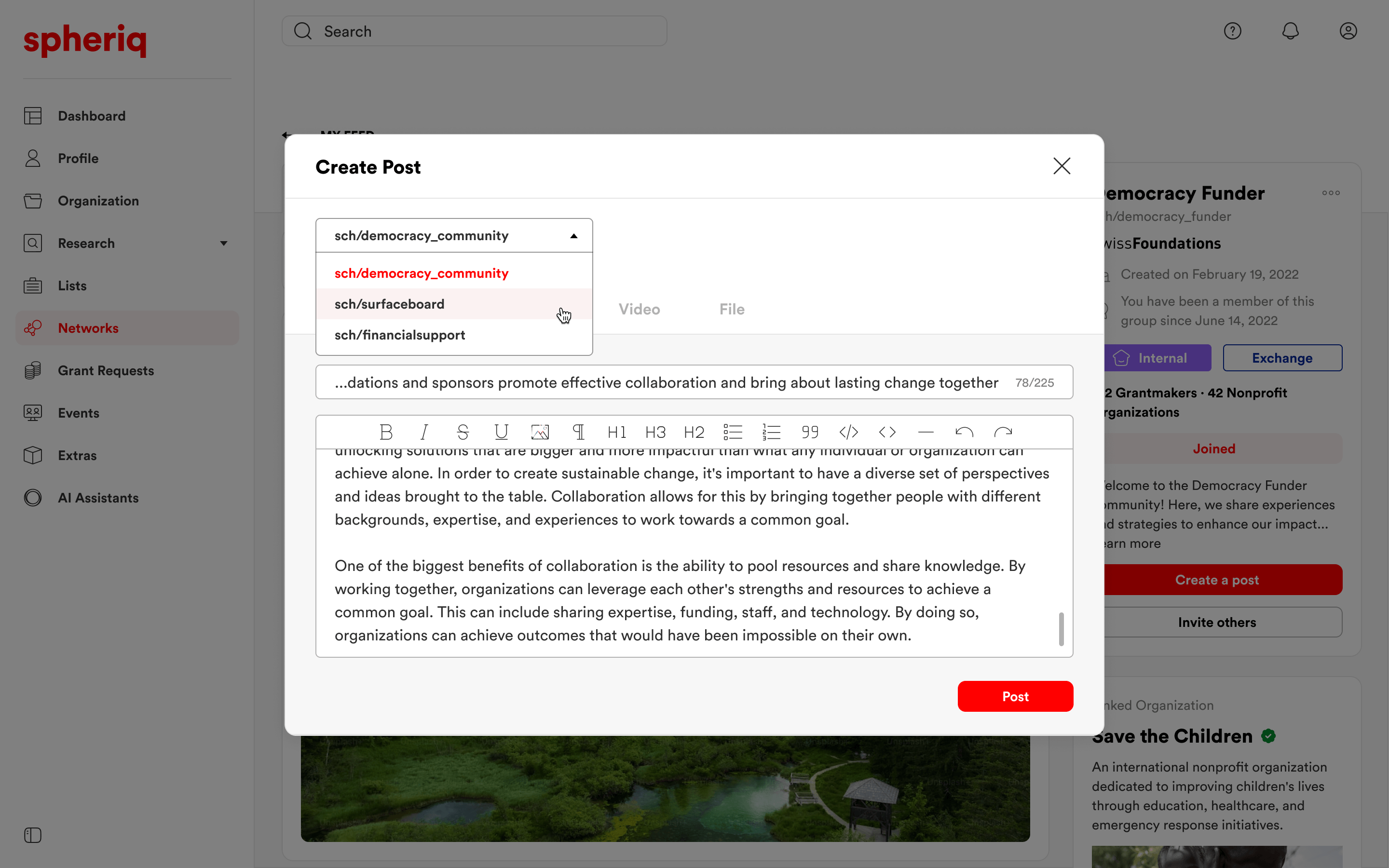
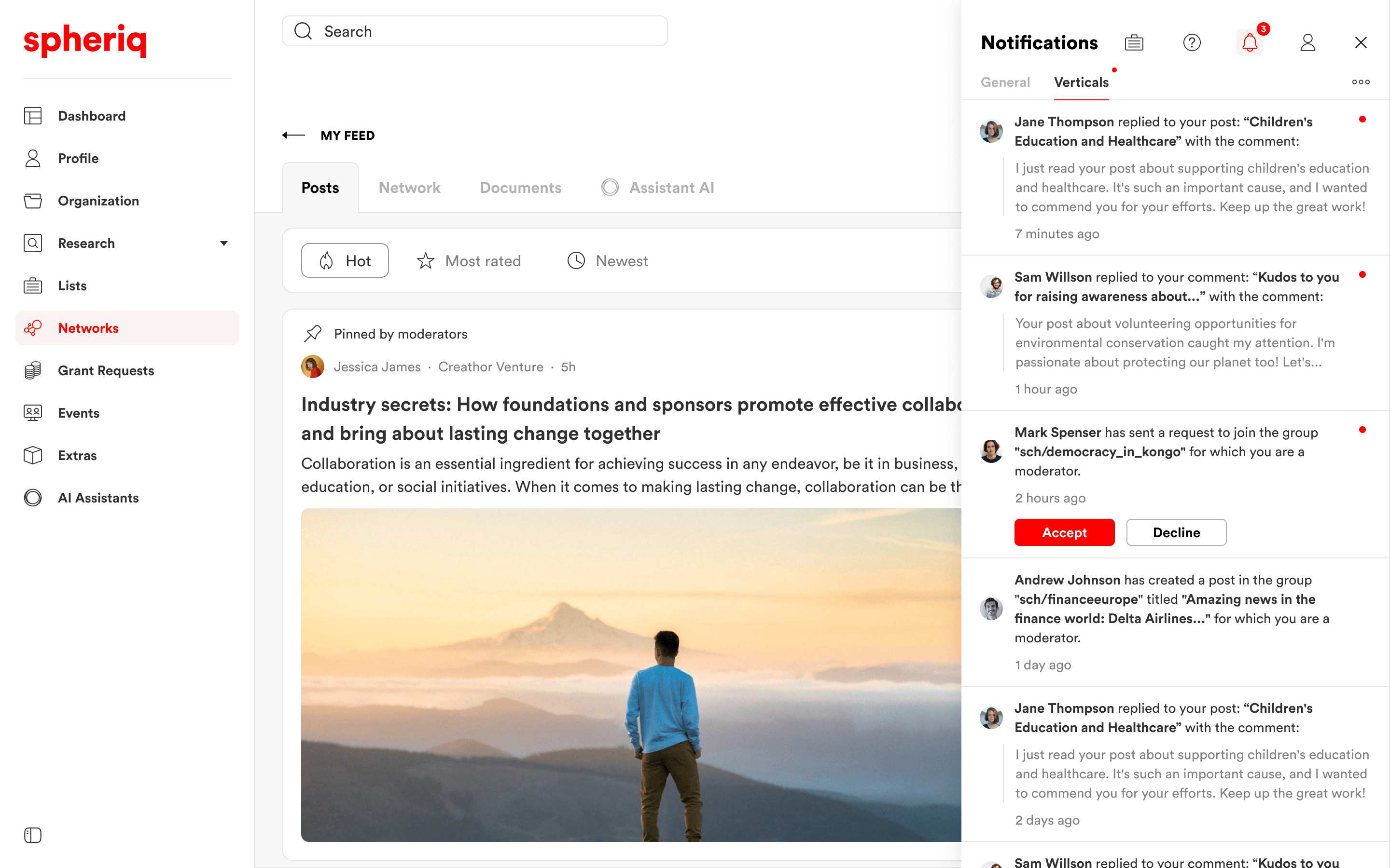
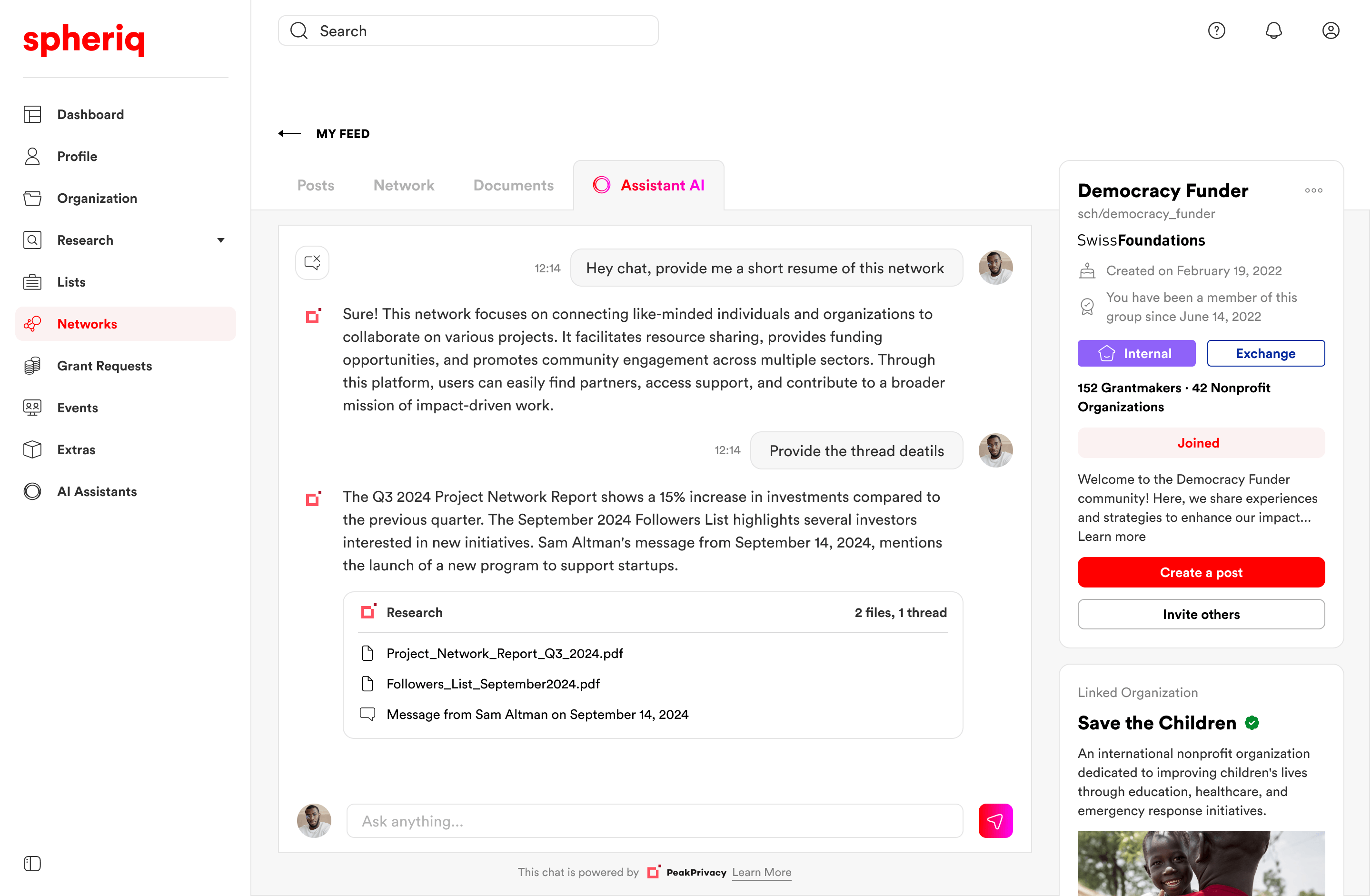
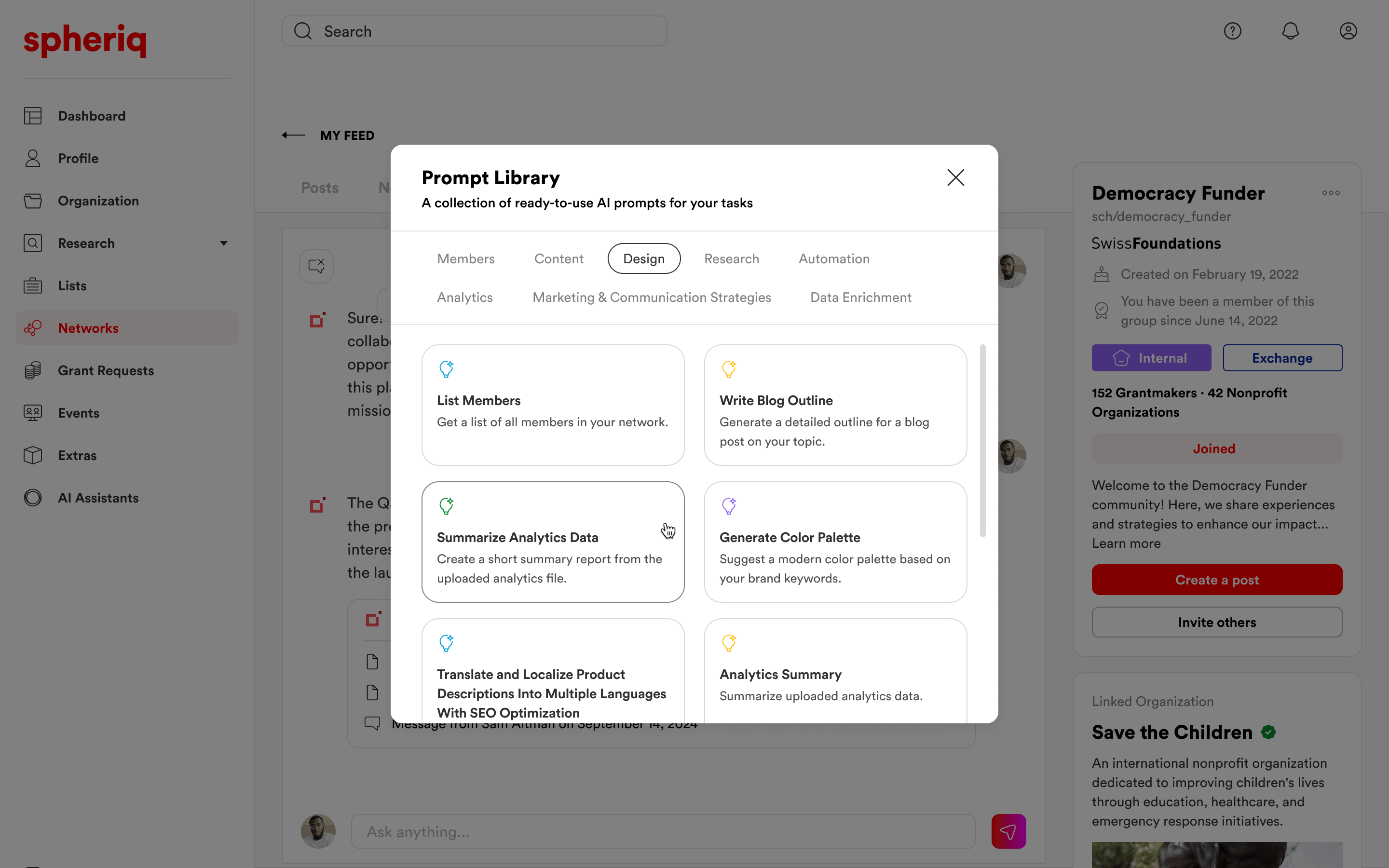
07 — Networks
Designing networks for professional collaboration
Networks gave users a place to work around shared topics. I designed group spaces where organizations, foundations, and experts could publish posts, share documents, create events, and follow relevant updates.
Unlike a simple feed, these spaces had to support ongoing work between different organizations: discussions, shared materials, events, moderation, and topic-based communities around funding and philanthropy.
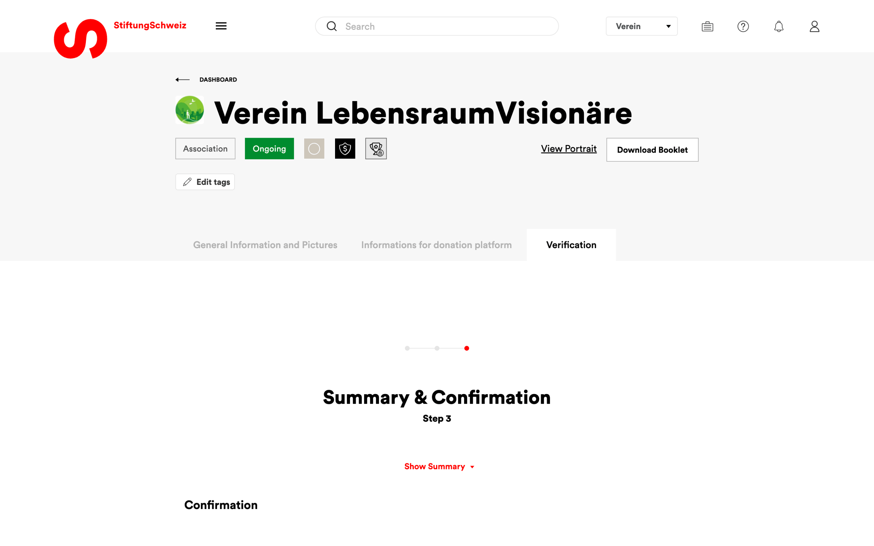
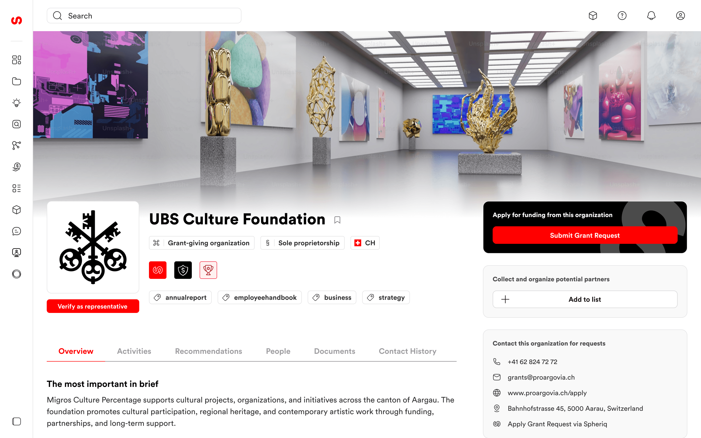
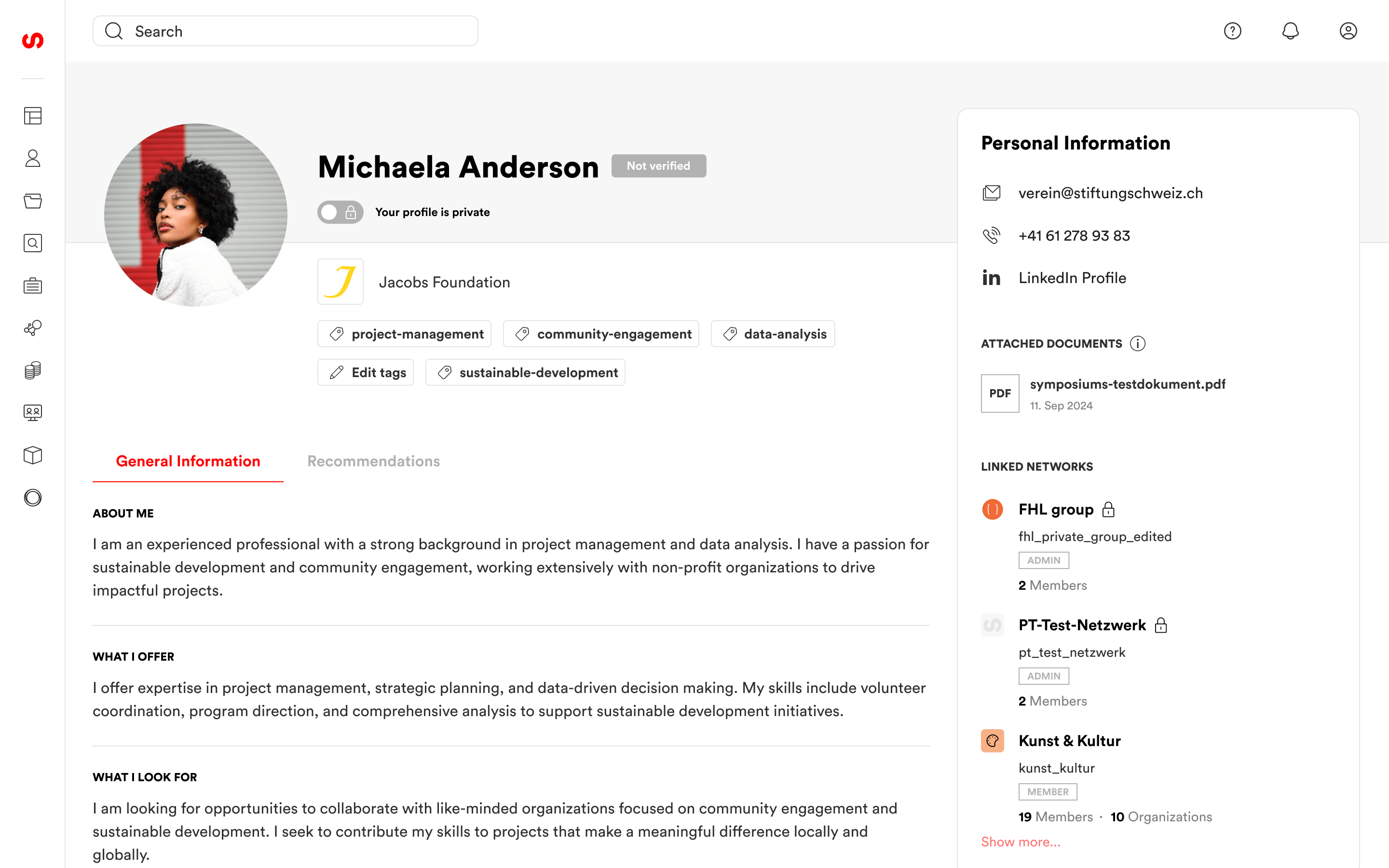
08 — Organization Portraits
Designing portraits as the main decision page
Organization portraits were one of the most important pages in the portal. For many users, they worked as the main face of an organization or project: a place to understand who is behind it, what they do, whether they are relevant, and what to do next.
I structured the page around two layers. The main area organized detailed information into tabs, while the right-side panel kept the most important actions close: saving to a list, contacting the organization, tracking the relationship, applying for funding, donating, subscribing, or opening connected networks.
The goal was to make a very information-heavy page easier to scan and act on. Users could quickly understand the organization, evaluate its relevance, and move to the next step without losing context.
09 — Design System
Building consistency while the product was moving
As the product grew, I gradually built and refined a design system in parallel — typography, colors, icons, tables, forms, navigation, modals, mobile patterns, and reusable components. The icon set was redesigned from scratch to bring consistency across all product areas.
10 — Supporting Workflows
Extending the platform across daily workflows
Beyond the core workflows, I also designed a wide range of supporting areas that helped the platform operate as a complete product: dashboards, notifications, donation tools, fundraising workflows, webinars, services, account settings, subscription states, and analytics-style modules.
These screens were smaller individually, but together they shaped the everyday experience of the platform and helped bring consistency across the ecosystem.
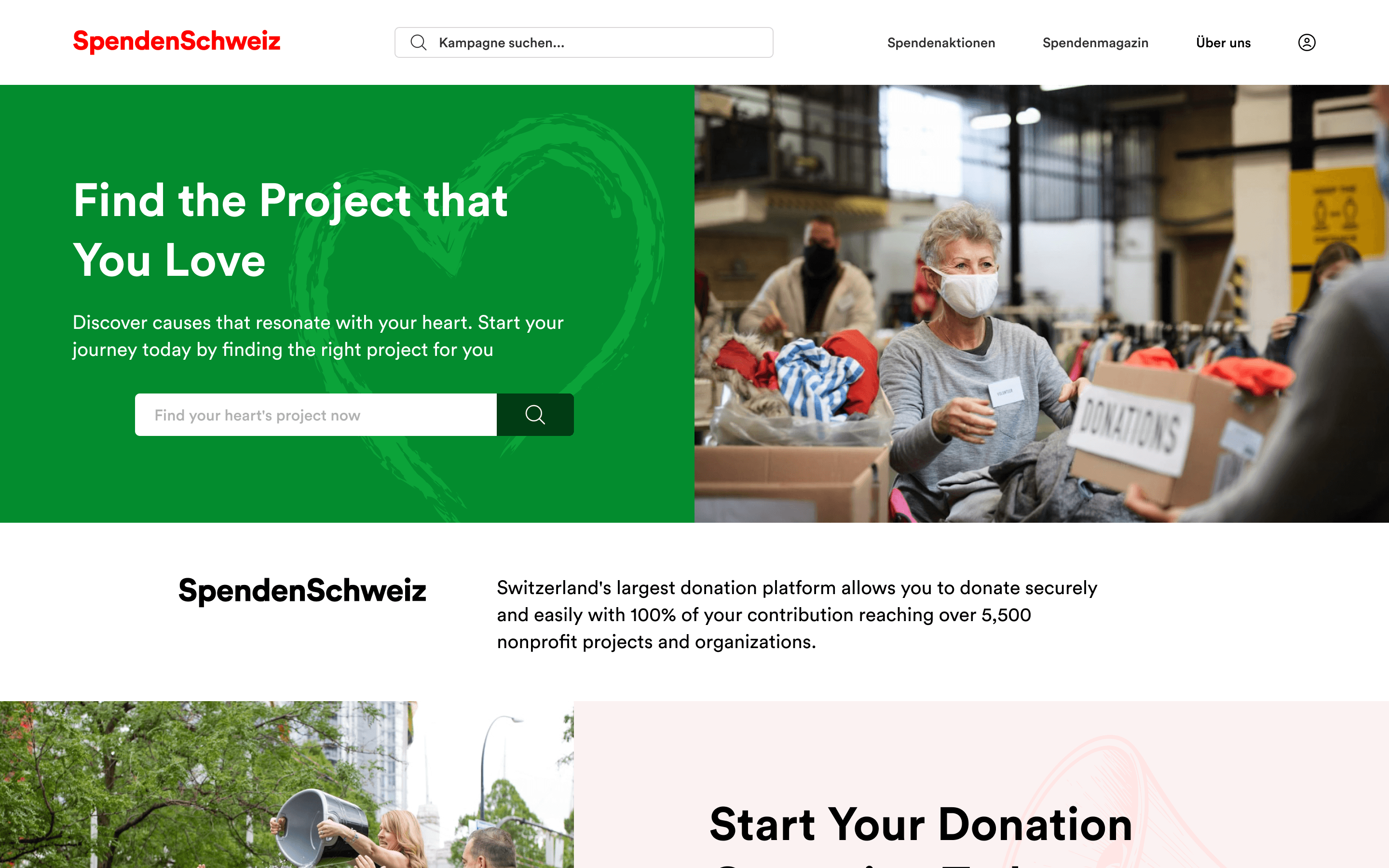
11 — Public Website
Explaining Spheriq to different audiences
Alongside the product, I also designed the public homepage for Spheriq. The page had to explain the platform to several audiences at once: organizations looking for funding, foundations looking for better tools, experts, companies, and the wider Swiss nonprofit sector.
The main challenge was to make Spheriq easy to understand without reducing it to a simple directory. The homepage had to show that the platform connects funding, research, collaboration, knowledge, and support around one shared sector.
12 — Impact & Learnings
Making a complex platform easier to use and maintain
Over three years, my work helped Spheriq move from a fragmented legacy portal toward a clearer and more connected product experience for the Swiss nonprofit sector.
I redesigned major product areas, improved the design system, and worked on core workflows for funding, research, collaboration, organization profiles, mobile, and the public website.
One of the main learnings was that large redesigns need system thinking from the beginning. When a design system is built in parallel with the product, every new module can expose missing patterns and force earlier decisions to be revisited.
What I learned
- Large redesigns are not only about better screens. They require understanding the existing product logic, technical limits, user habits, and how one module affects the rest of the system.
- A design system should be defined early. When it is built too late, every new module reveals missing patterns and forces earlier decisions to be adjusted.
- In a live product, it is not always realistic to change everything at once. I learned to improve the portal gradually, working around time, budget, and technical constraints, while keeping old and new parts of the experience connected.