American Red Cross trains over 330,000 lifeguards every year, making it the largest provider of lifeguard certification in the US. They came to us with a specific need: give beginner lifeguards realistic, repeatable practice before they ever stand at a real pool. I led the design of a VR training experience and a companion admin panel for tracking student performance across schools and regions.
01 — Research
Understanding the problem
I started with qualitative interviews, speaking directly with Red Cross instructors and program leads. Two things came up consistently: a rising number of drowning incidents in public pools, and a real gap between what students learn in the classroom and what they're ready for in the field. No amount of lecture prepares you for the moment someone stops moving in the water.
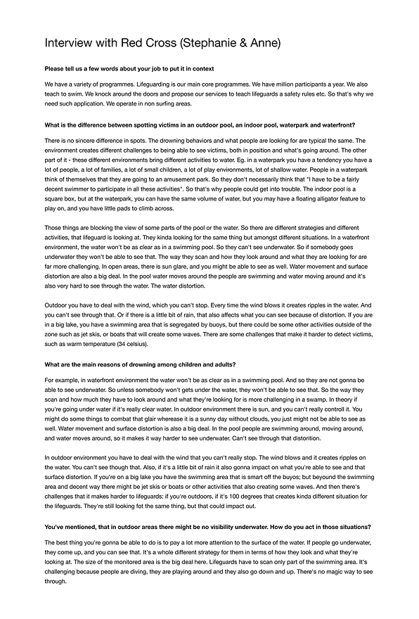
To build realistic scenarios, I also studied dozens of real-world video reports, looking at how drowning victims behave, how quickly situations escalate, and what effective rescues actually look like. That research directly shaped the scenario timing and character actions in the experience.
02 — Strategy
Goals and scope
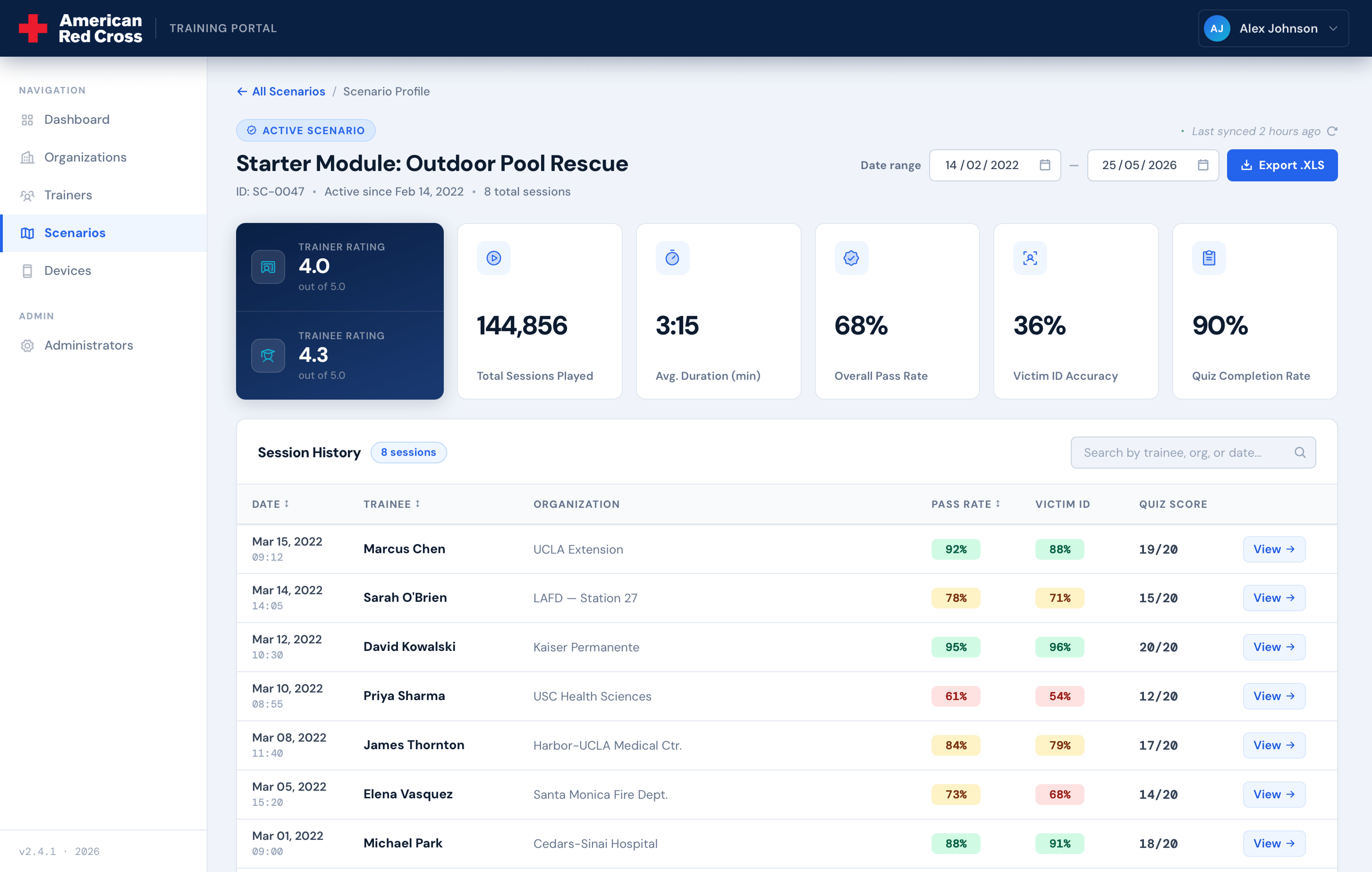
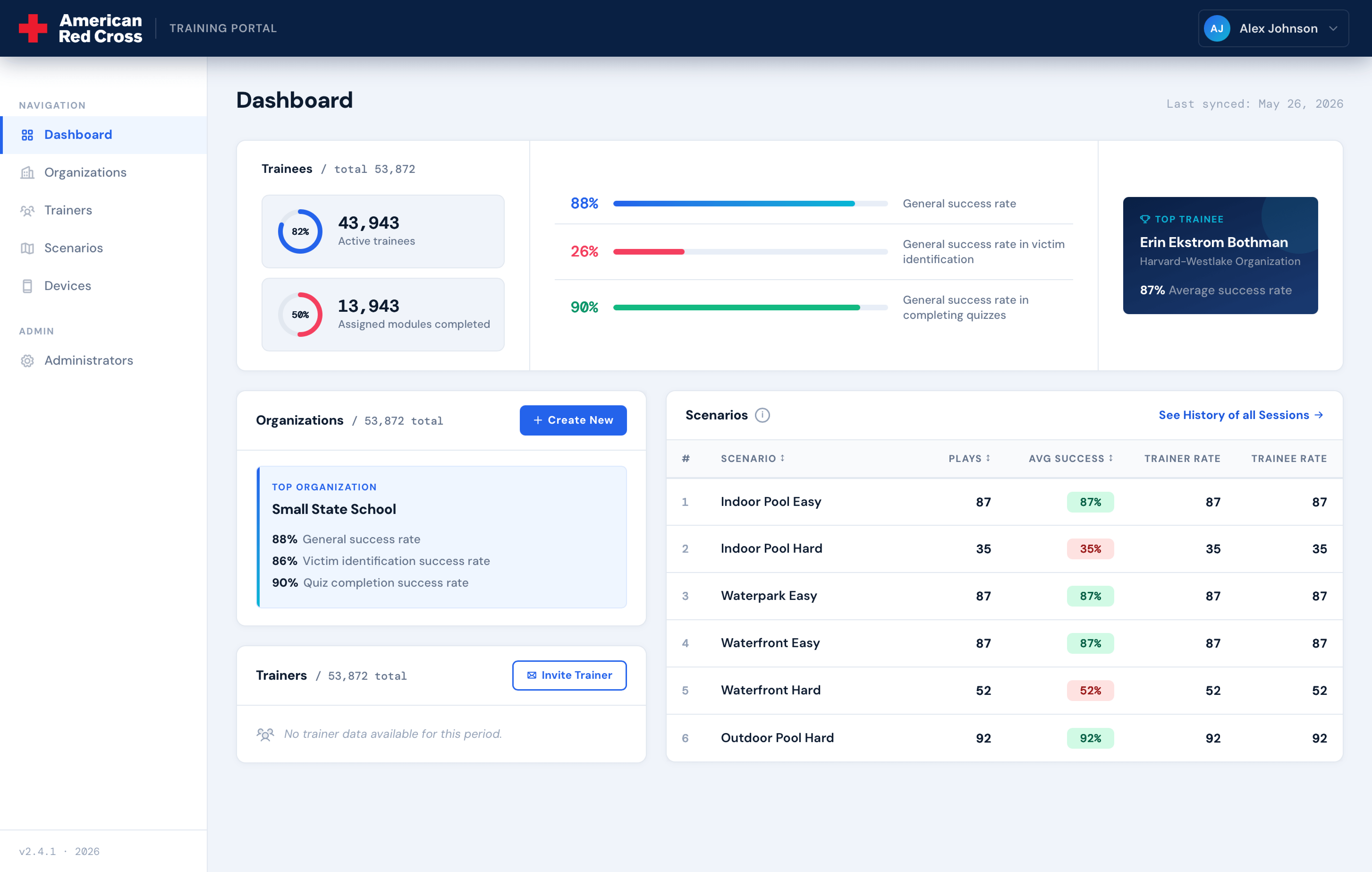
I defined three goals for the product: give students immersive practice across different environments, improve their ability to spot and respond to drowning in real time, and give Red Cross visibility into performance data across schools and regions.
The client came in with a long feature list: school moderation, teacher roles, modular lesson builders. After the research phase, I decided to cut all of it from v1. None of those features were needed to validate the core experience, and building scope that doesn't serve your main goals just slows everything down.
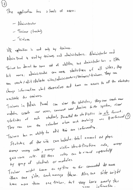
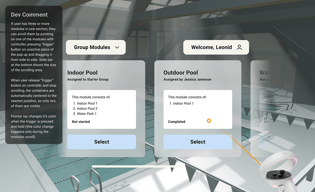
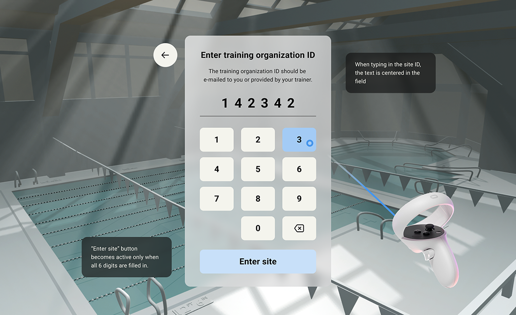
With a tighter scope, I wrote user stories for each role (student, instructor, admin) and used them to map out the full application logic across both the VR experience and the admin panel. Locking the requirements at this stage made the information architecture straightforward.
03 — Information Architecture
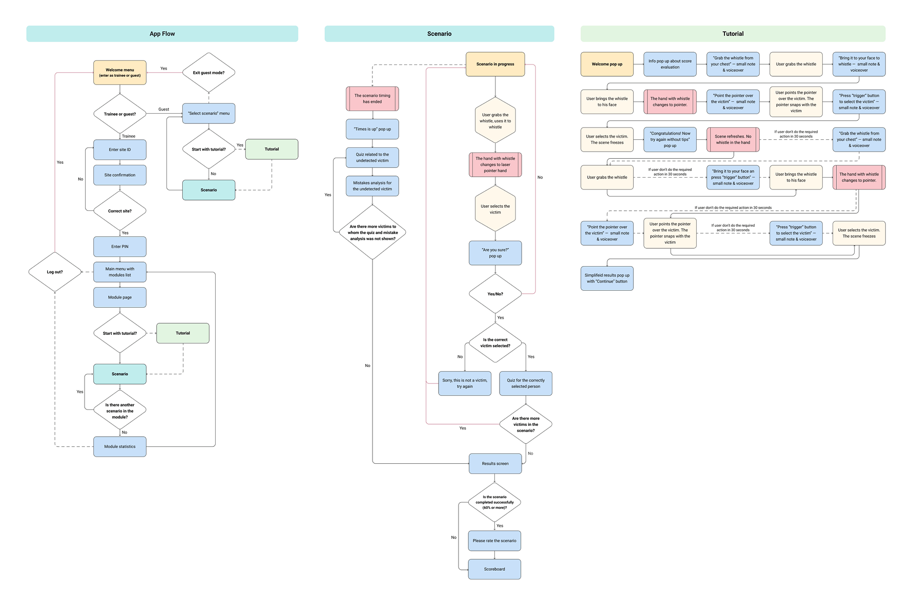
User flow
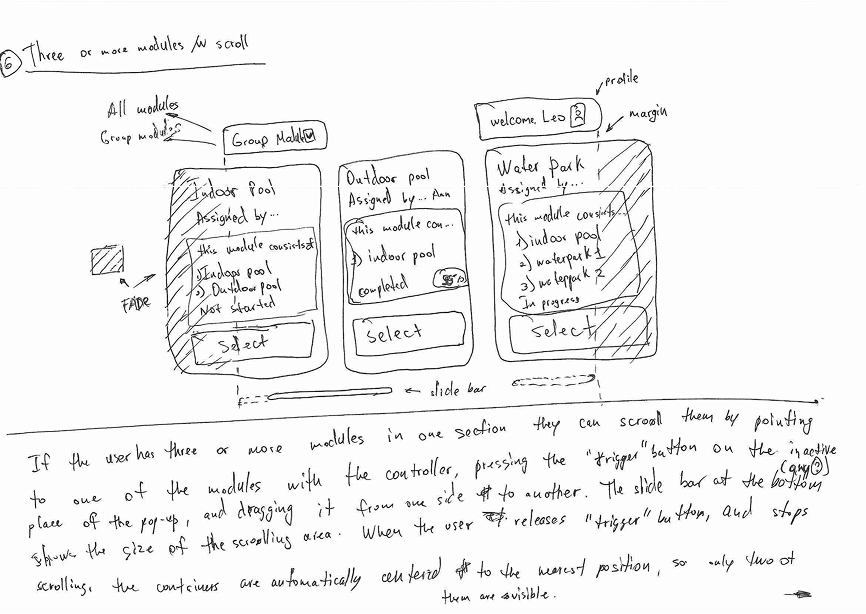
With user stories in place, I mapped the full user flow for both the VR headset experience and the admin panel. The goal was simple: make sure every action had a clear trigger and outcome before a single wireframe was drawn.
04 — Experience Design
Scenario structure
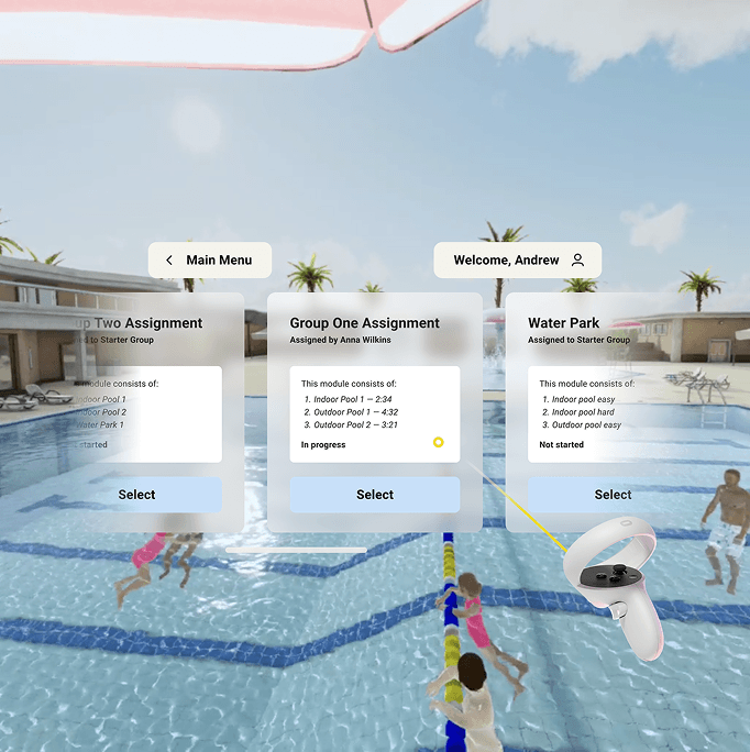
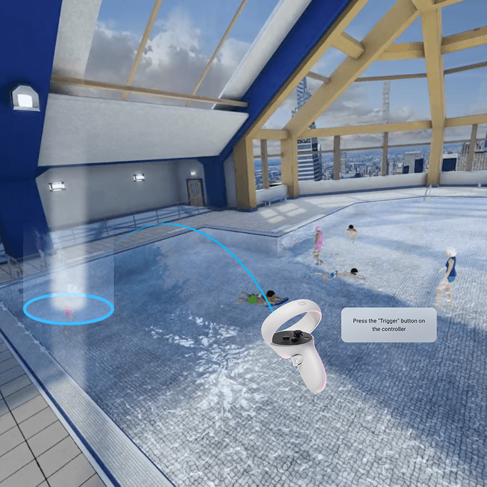
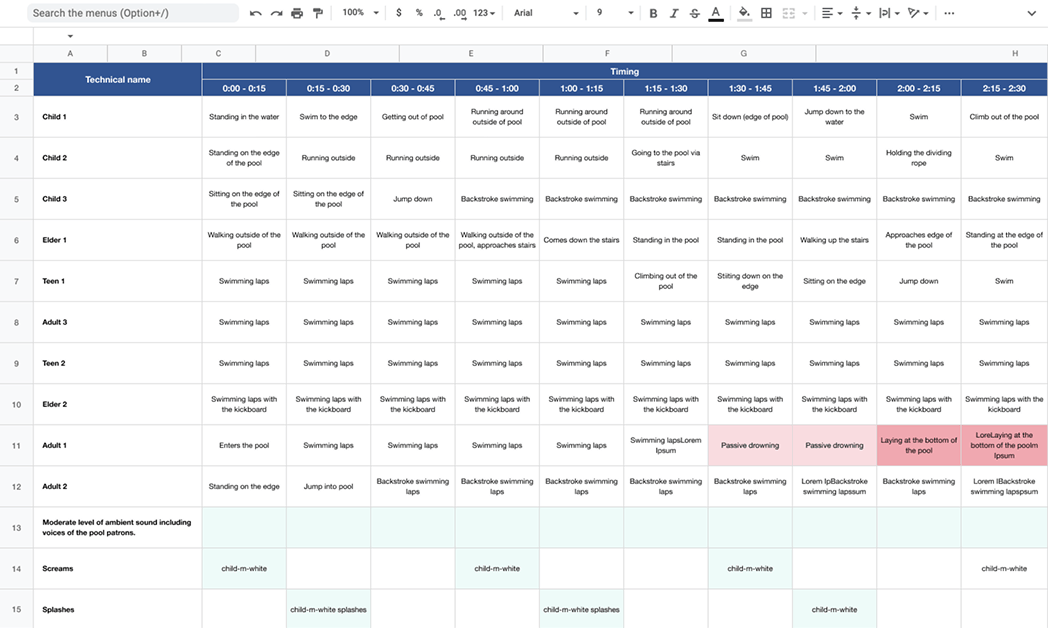
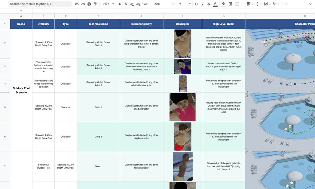
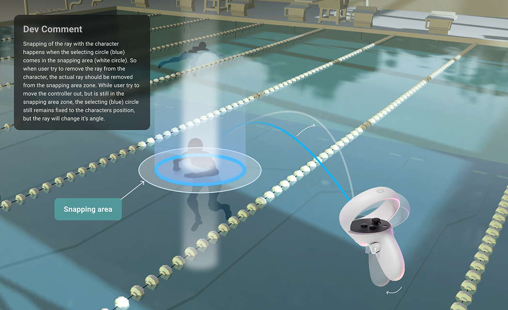
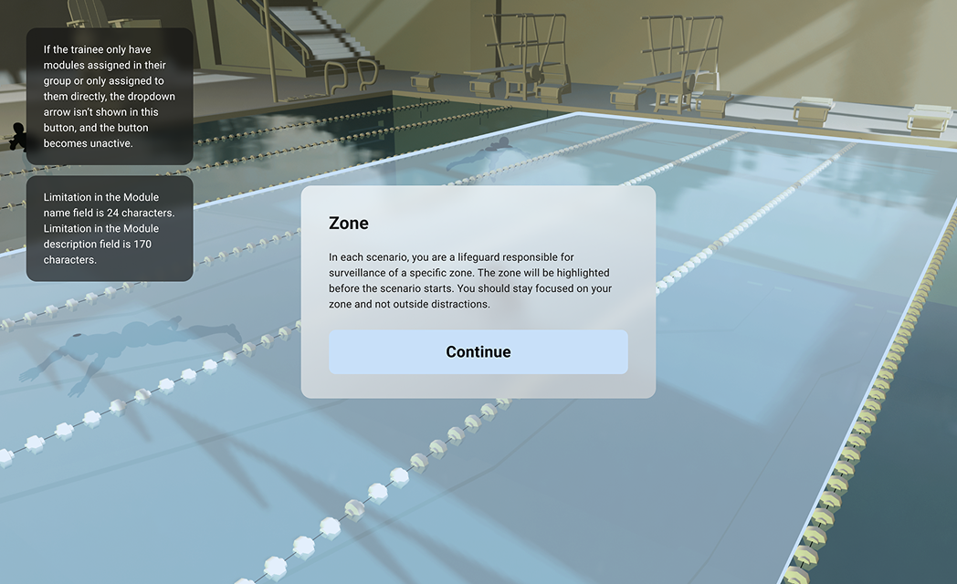
The training experience is built around four scenarios: an outdoor pool, an indoor pool, a promenade, and a water park. Each one has its own environment and cast of characters. I scripted every character's behavior second by second, defining exactly when and how each incident unfolds. The timing mattered a lot here. Too slow and students disengage, too fast and the scenario stops feeling real.
I worked closely with the 3D team throughout, using detailed scripts as a shared reference:
05 — Wireframing
Wireframes
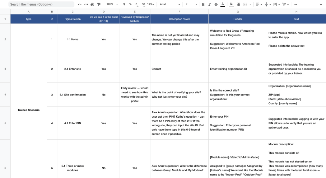
Wireframing happened in close sync with the client and dev team, with regular check-ins to adjust and align. I treated wireframes as conversation tools rather than deliverables. The point was to get everyone on the same page about how things should work before spending time on visual design.
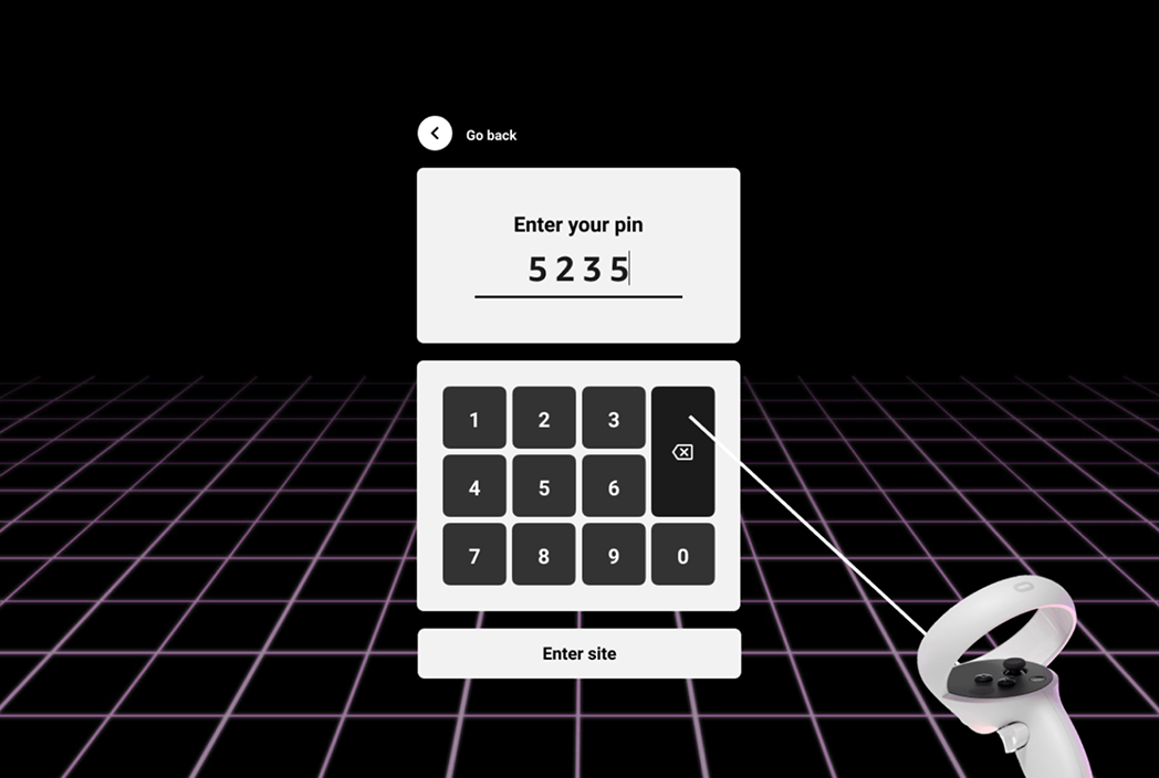
VR
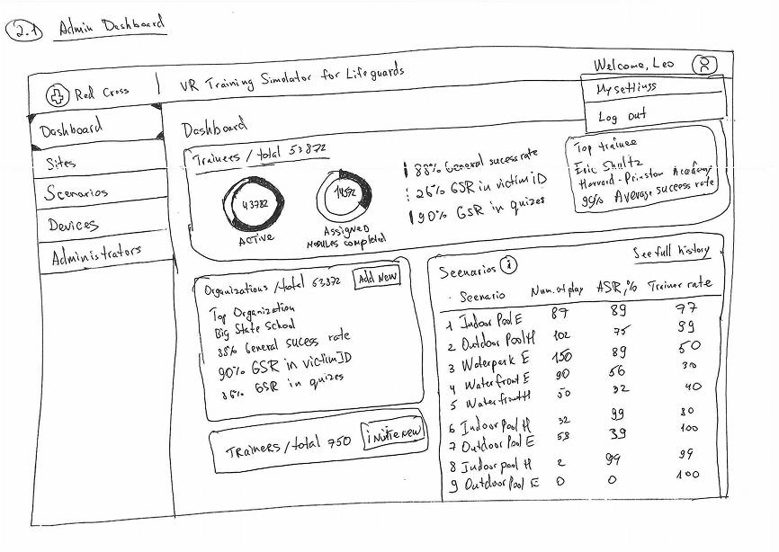
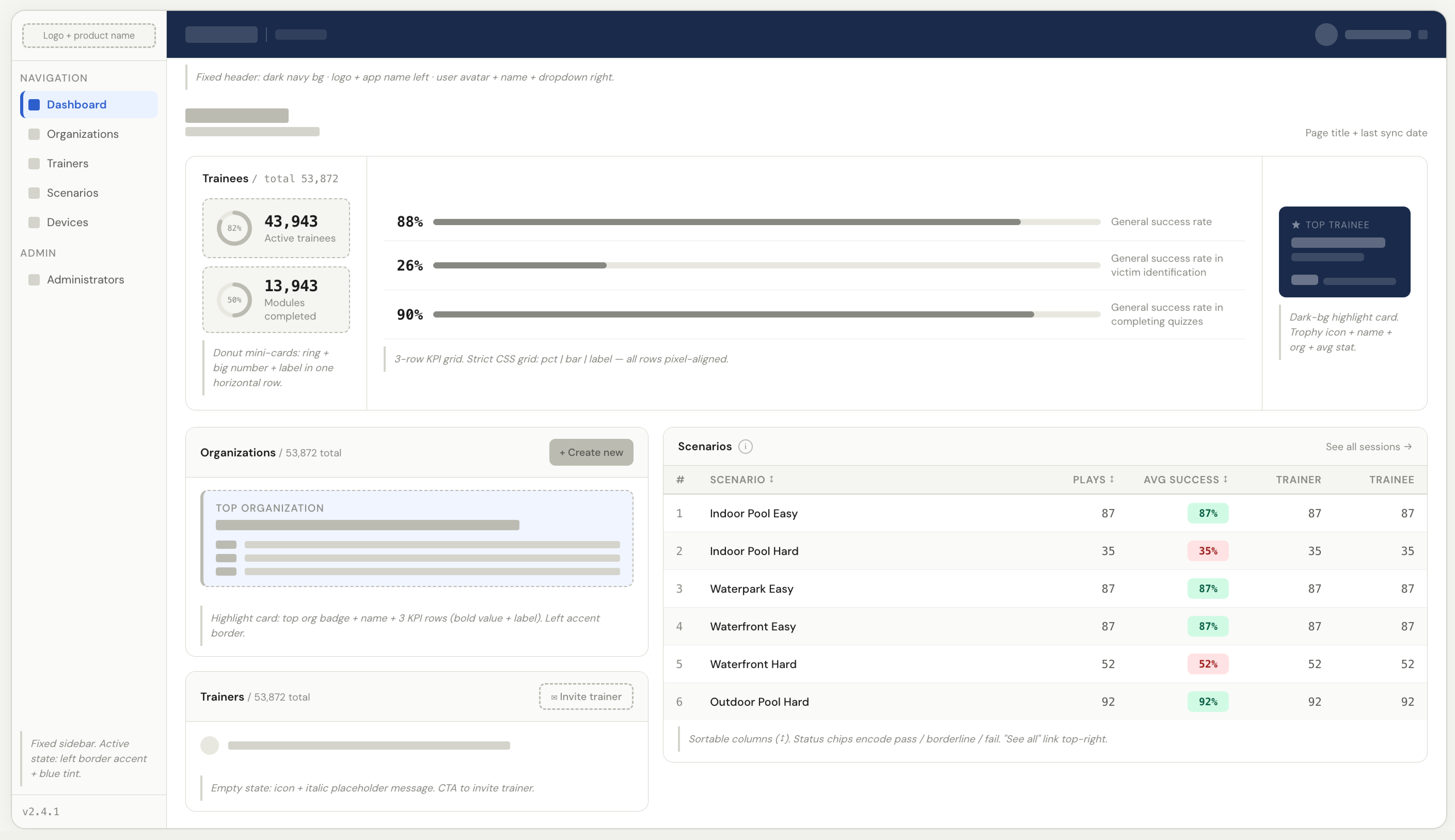
Admin Panel
06 — Visual Design
UI Design
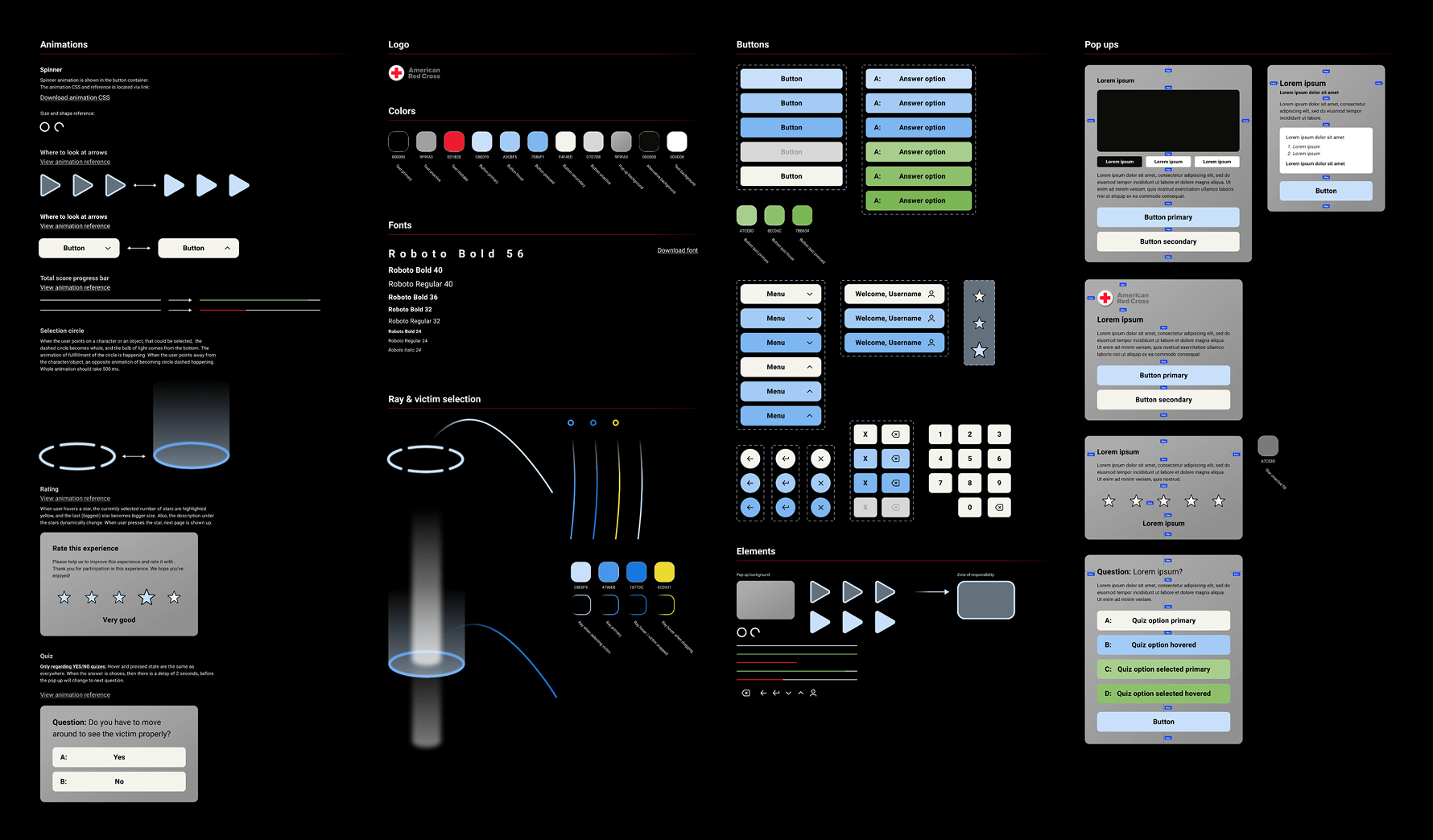
With wireframes signed off, I moved into visual design. I started with a full design kit to establish the system before touching individual screens.
With the design system in place, I moved through screens quickly. Since the wireframes were already approved, there was no need to go back to the client for sign-off at each step. I annotated every frame with notes for developers covering interactions, states, and edge cases.
VR
Admin Panel
07 — UX Writing & Sound
Content and sound design
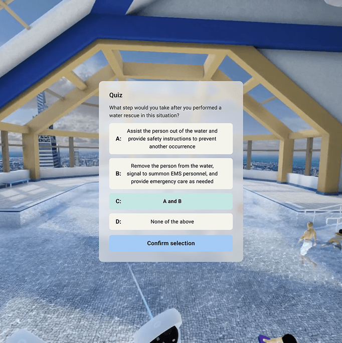
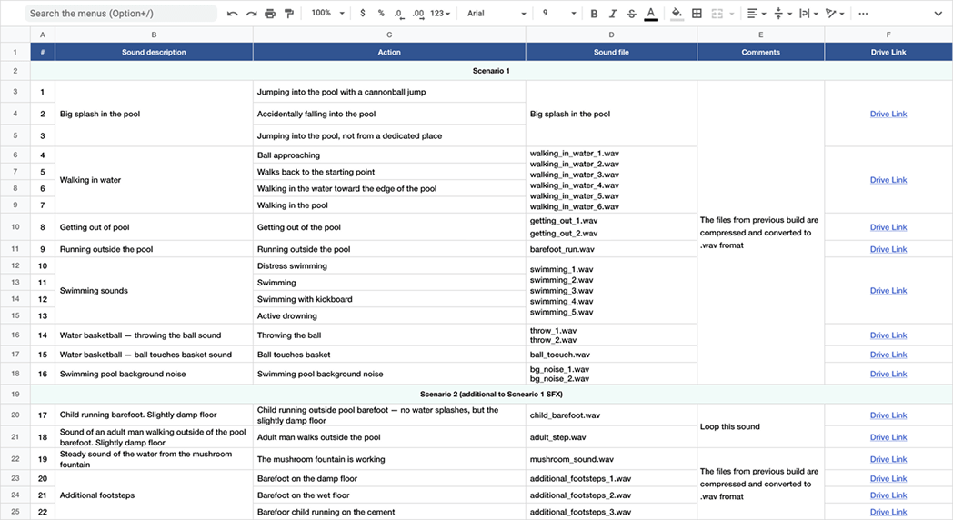
I wrote all the in-experience copy: every instruction, prompt, and feedback message. The main constraint was keeping the student moving toward the right action without breaking immersion. For sound, I sourced and placed ambient audio and character voices across all four scenarios, making sure each environment felt believable to be in.
UX writing
Sound design
08 — Testing
QA and iteration
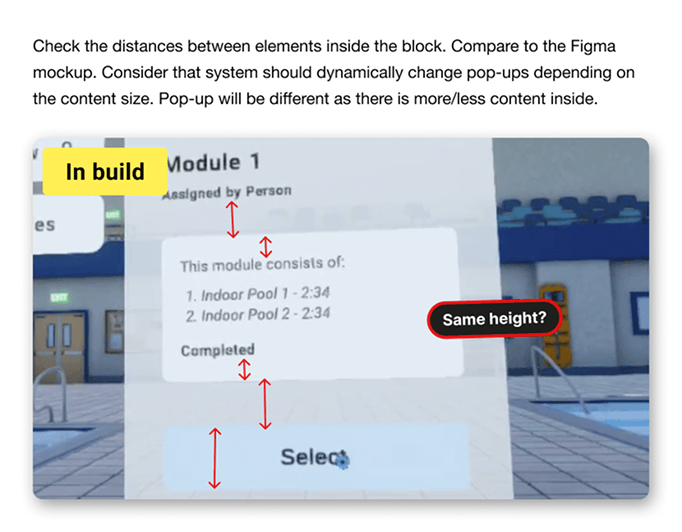
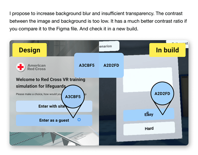
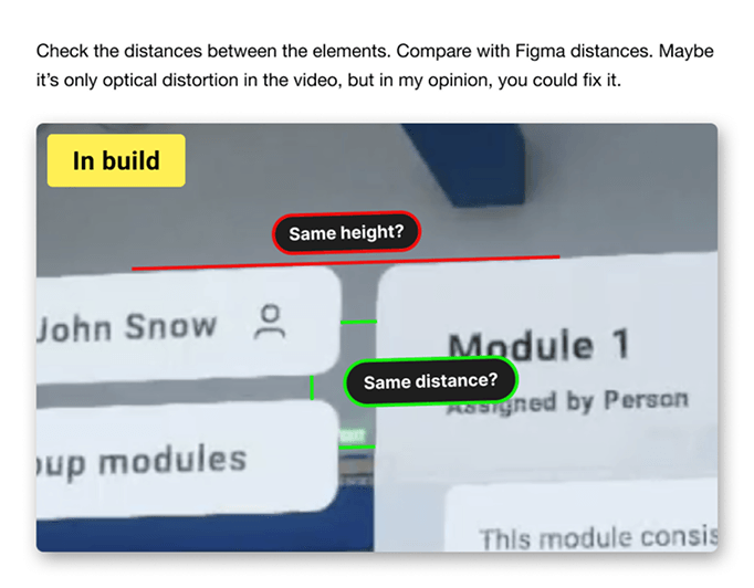
Once the first builds were ready, I ran QA myself, logging UI and UX issues and working with the dev team to prioritize fixes. We moved through iterations quickly and most problems were resolved before the next build came out.
09 — Results
Impact
Within the first months of deployment, the product hit all three goals. Students got structured, repeatable practice across environments they'd never trained in before. Red Cross collected performance data across schools and regions for the first time. And the number of deadly incidents at pools supervised by Red Cross graduates dropped by 23%.
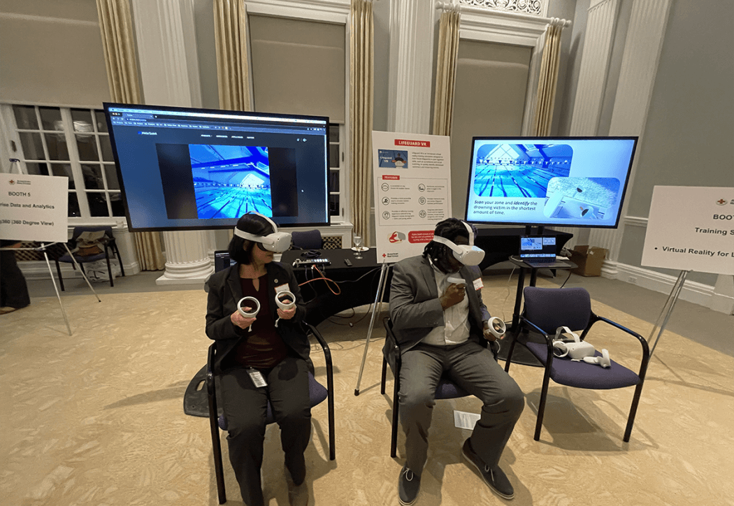
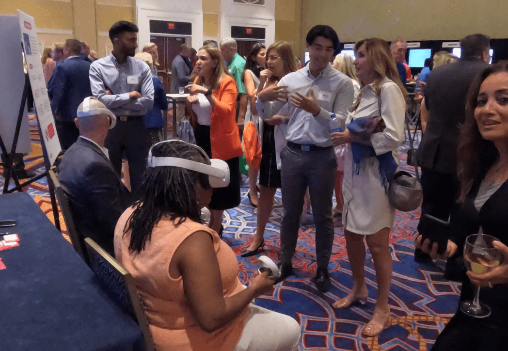
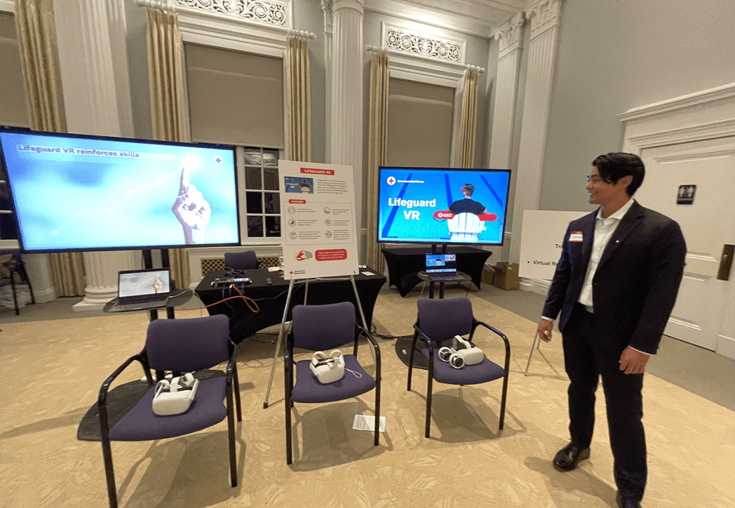
The product was also shown at industry expos, where it got a strong response from instructors, administrators, and students who tried it firsthand.
Deadly incidents at pools guarded by Red Cross graduates within one year of launch.
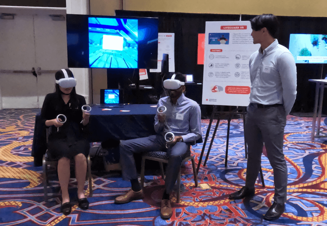
"Thank you, everyone, for your fantastic work! Here are the photos from the expo 🙂"
10 — Reflection
What I'd do differently
- Allocate more time for the UI polish handoff. Developer annotations helped, but some implementation drift still happened that extra review sessions would have caught.
- Run a focus group before client delivery. A round of structured user testing would have surfaced friction we only found during QA.
- Set up a feedback loop after launch. Collecting data from real users post-deployment would have made the next iteration much more focused.